
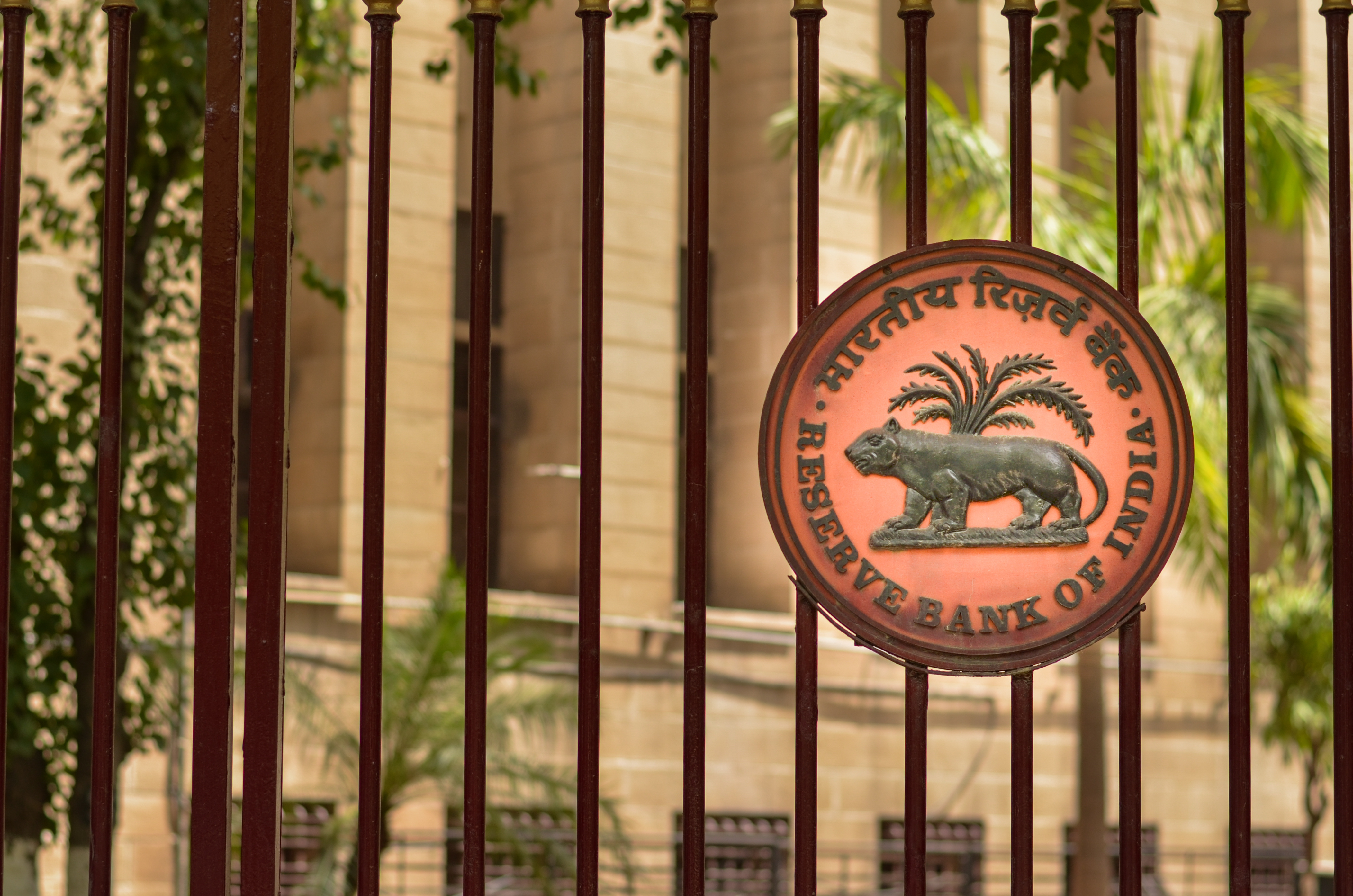
RBI
User Researcher
Lead Product Designer
PwC Design Team
Adobe XD
8 Months
New Delhi, 2022
Live Website︎︎︎
Designing an inclusive and accessible and inclusive user experience for The Reserve Bank of India.
Enhancing the user experience of RBI website and mobile app catering to a diverse audience, including individuals seeking information, academics, and professionals, these platforms serve as crucial repositories for communications of regulated entities, public notifications, and research papers. We prioritized usability to ensure an interactive, smooth experience throughout the user journey, fostering engagement and accessibility for all.
Project Goals
ESTABLISHING THE BIGGER PICTURE
-
Establish an all-encompassing and flexible website and mobile app, with a strong emphasis on accessibility.
-
Elevate the overall Net Promoter Score (NPS) across all three categories: promoters, detractors, and passives.
- Construct a revitalized visual identity and user interface that harmoniously blends India's rich historical heritage and modern advancements to serve the diverse population of billions in the country.
Research Objectives
OVERALL PROJECT GUIDELINES
- Enhancing the information structure of the RBI websites.
- Promote a user experience that is both intuitive and interactive for RBI users.
- Introduce features aimed at enhancing the overall functionality of RBI websites.
- Contribute to the enhancement of RBI's website performance by conducting SEO and traffic analysis based on selected benchmarks.
Stakeholder Immersions
DESIGN FACILITATION AND SME INTERVIEWS
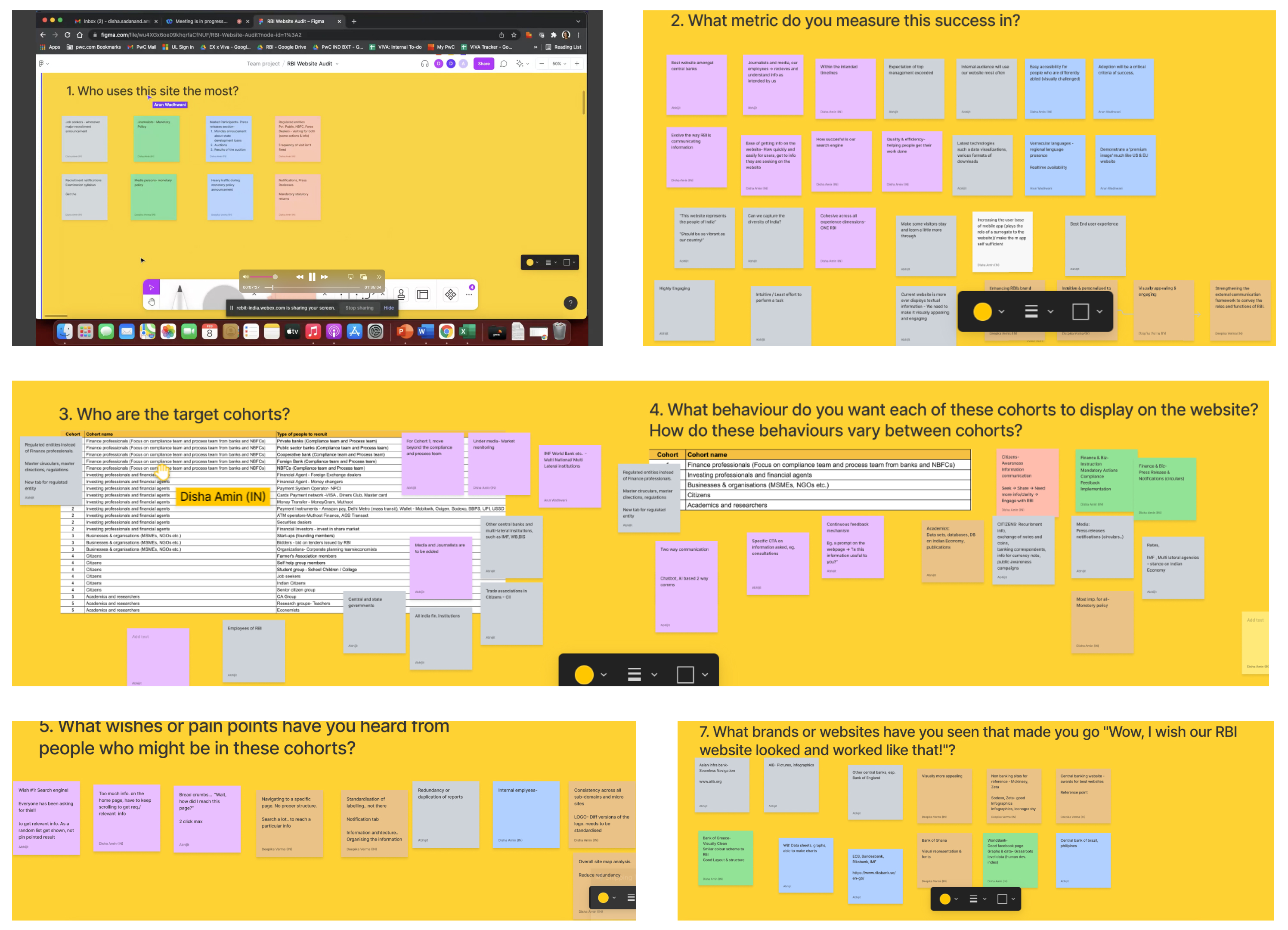
We conducted multiple whiteboard sessions with the client to gain a deeper insight into the desired final outcome. This process aided in determining the right candidates for user research, resource allocation, as well as project planning and management.
![]()
We conducted multiple whiteboard sessions with the client to gain a deeper insight into the desired final outcome. This process aided in determining the right candidates for user research, resource allocation, as well as project planning and management.
User Groups
FOLLOWERS
Users who are associated with regulated entities need to adhere to the guidelines laid down by the RBI e.g. Private Banks, Foreign Exchange, etc.
GUIDANCE SEEKERS
Businesses & organizations that seek guidance/direction from RBI to make key business decisions.
Users who are associated with regulated entities need to adhere to the guidelines laid down by the RBI e.g. Private Banks, Foreign Exchange, etc.
GUIDANCE SEEKERS
Businesses & organizations that seek guidance/direction from RBI to make key business decisions.
INFORMATION
SEEKERS
They seek information such as news updates, job opportunities, RBI exam updates, etc.
INFORMATION SUPER USERS
This cohort conducts detailed analyses and/or processes information and data on the website and/or creates a work product out of the information e.g. Academicians, Researchers.
Additionally, website feedback was also
obtained from internal RBI Stakeholders.
Competitive Analysis
SETTING A BENCHMARK
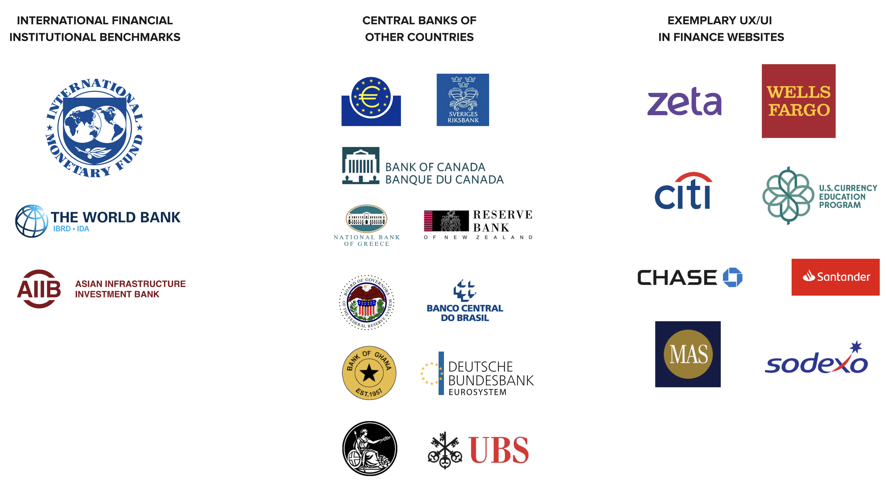
To initiate the research process, we conducted a comprehensive review of various international banks, central banks, financial institutions, and exemplary finance-related UI/UX apps and websites.
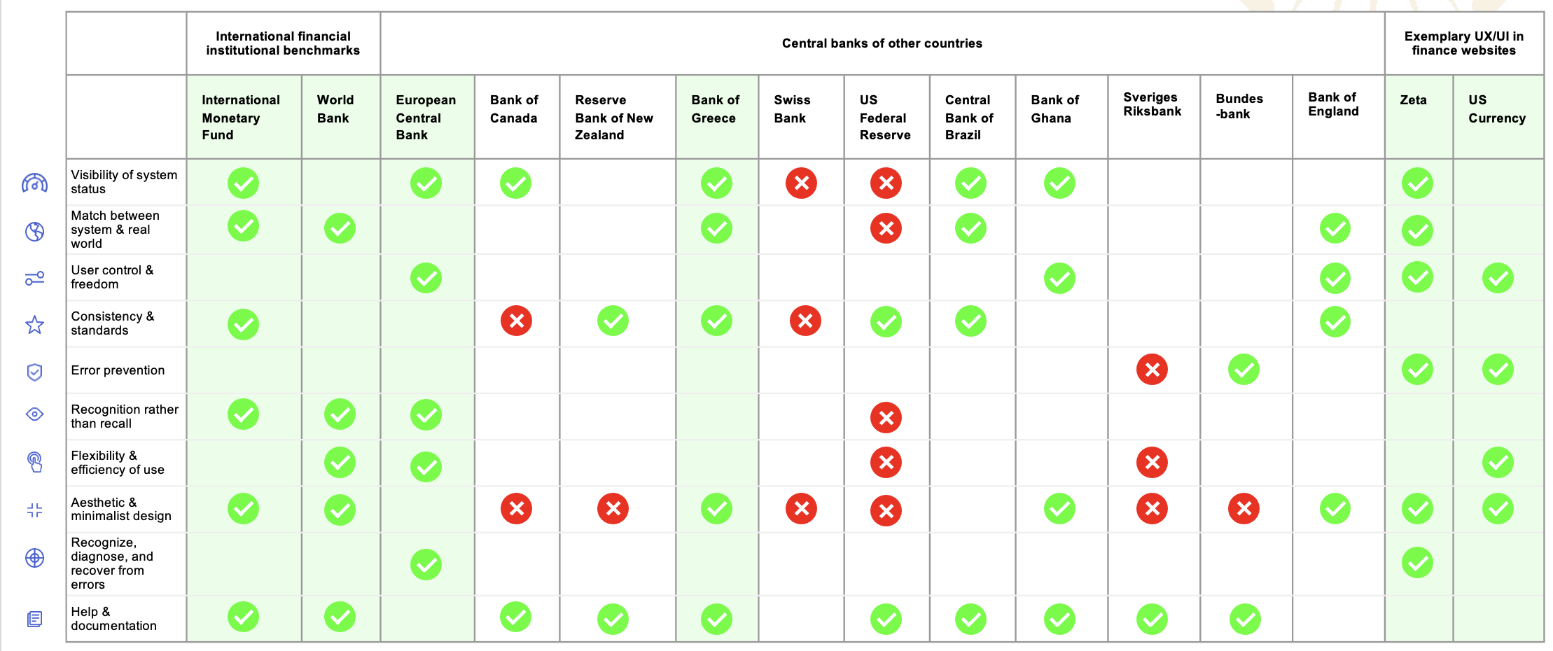
Our analysis framework revolved around assessing websites in terms of usability (examining ease of navigation and the overall user experience), functionality (identifying essential features that enhance user interaction), and performance (measuring website traffic and SEO performance to apply similar enhancements to RBI's sites).
![]()
We employed heuristic evaluation and analyzed performance metrics such as bounce rates, traffic counts, and keyword usage to understand the industry.
![]()
To initiate the research process, we conducted a comprehensive review of various international banks, central banks, financial institutions, and exemplary finance-related UI/UX apps and websites.
Our analysis framework revolved around assessing websites in terms of usability (examining ease of navigation and the overall user experience), functionality (identifying essential features that enhance user interaction), and performance (measuring website traffic and SEO performance to apply similar enhancements to RBI's sites).
We employed heuristic evaluation and analyzed performance metrics such as bounce rates, traffic counts, and keyword usage to understand the industry.
Survey
OBJECTIVES
- Expand on the current users' views and intentions for using the RBI website and app.
- Comprehend the various paths and essential actions associated with each user persona.
- Spotlight obstacles and areas of discomfort within the user experience and propose enhancements for both the website and app.
- Unearth valuable insights and offer relevant recommendations to enhance usability and functionality.
DATA ANALYSIS
200 responders:
Survey completion rate: 47%
Number of complete responses: 77
200 responders:
- 71 followers
- 56 guidance seekers
- 27 information seekers
- 10 information super users
- 36 RBI employees
Survey completion rate: 47%
Number of complete responses: 77
Survey Insights
TOP TAKEAWAYS
![]()
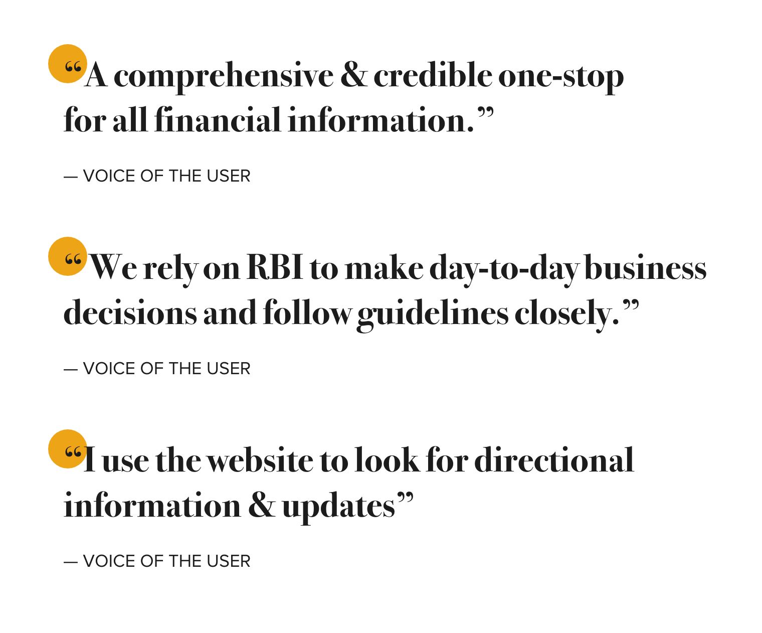
- The RBI is perceived as the primary and trustworthy source of financial information. However, the website's visual design appears outdated and doesn't align with the RBI's esteemed reputation.
- Desktop usage remains the most prevalent, while the mobile user interface is not adequately optimized for accessibility. Low app utilization results from limited awareness and insufficient incentives.
- The main experiential challenge lies in the discovery of information, particularly on critical pages like circulars and notifications. Levels of satisfaction with the RBI website tend to rise with increased frequency of use by different user cohorts.
- Improvement areas encompass giving more prominence to "RBI Kehta Hai" for the benefit of the general public and introducing personalized features, such as automatic updates based on users' areas of interest.

User Interviews
OBJECTIVES
- Gain insight into the journeys and essential tasks of each user persona of a follower, information seeker, guidance seeker and information super user.
- Explore the present perceptions and motives of users regarding their use of the RBI website.
- Recognize challenges and areas of discomfort within these journeys, and propose enhancements.
- Unearth valuable insights that lead to recommendations for improving usability and functionality.
30 INTERVIEWEES
OPPORTUNITY
Accessible Inclusivity
An experience that celebrates the vastness of wisdom that RBI has to offer to its users, without being intimidating.
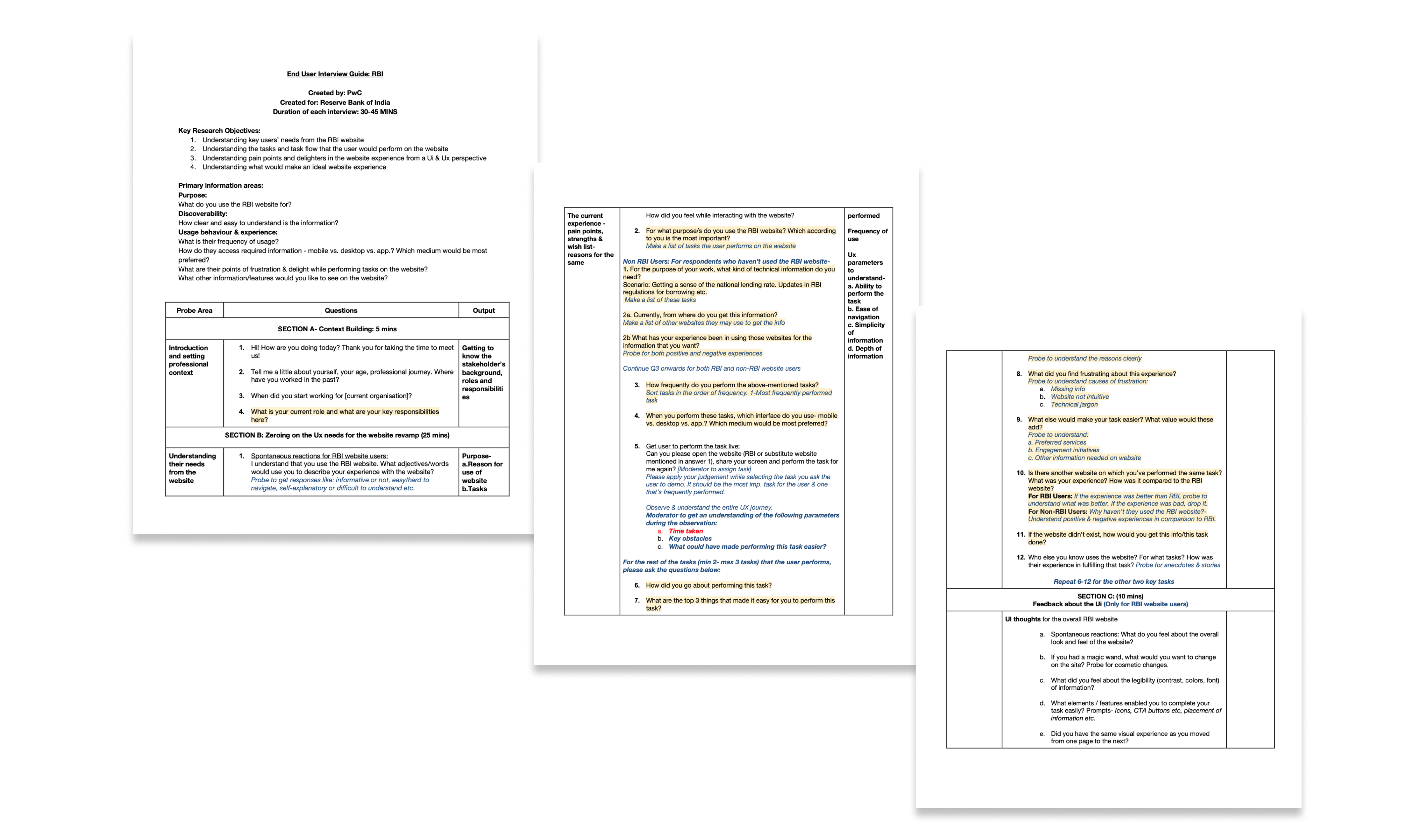
RECRUITMENT AND ANALYSIS DOCUMENTATION︎︎︎
INTERVIEW GUIDE︎︎︎
- 11 Followers
- 6 Guidance Seekers
- 5 Information Seekers
- 8 Information Super Users
OPPORTUNITY
Accessible Inclusivity
An experience that celebrates the vastness of wisdom that RBI has to offer to its users, without being intimidating.
RECRUITMENT AND ANALYSIS DOCUMENTATION︎︎︎
INTERVIEW GUIDE︎︎︎
Interview Insights
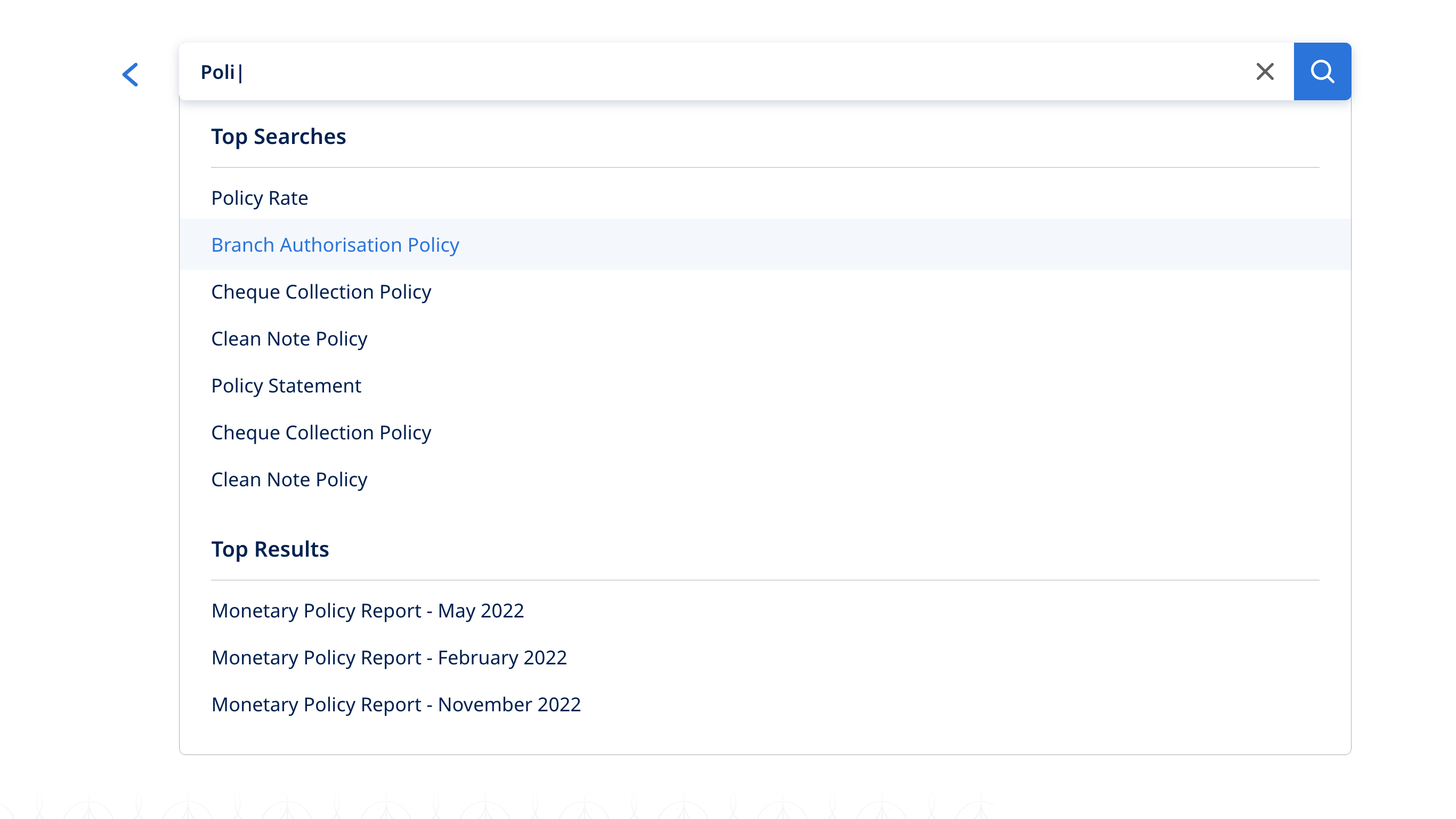
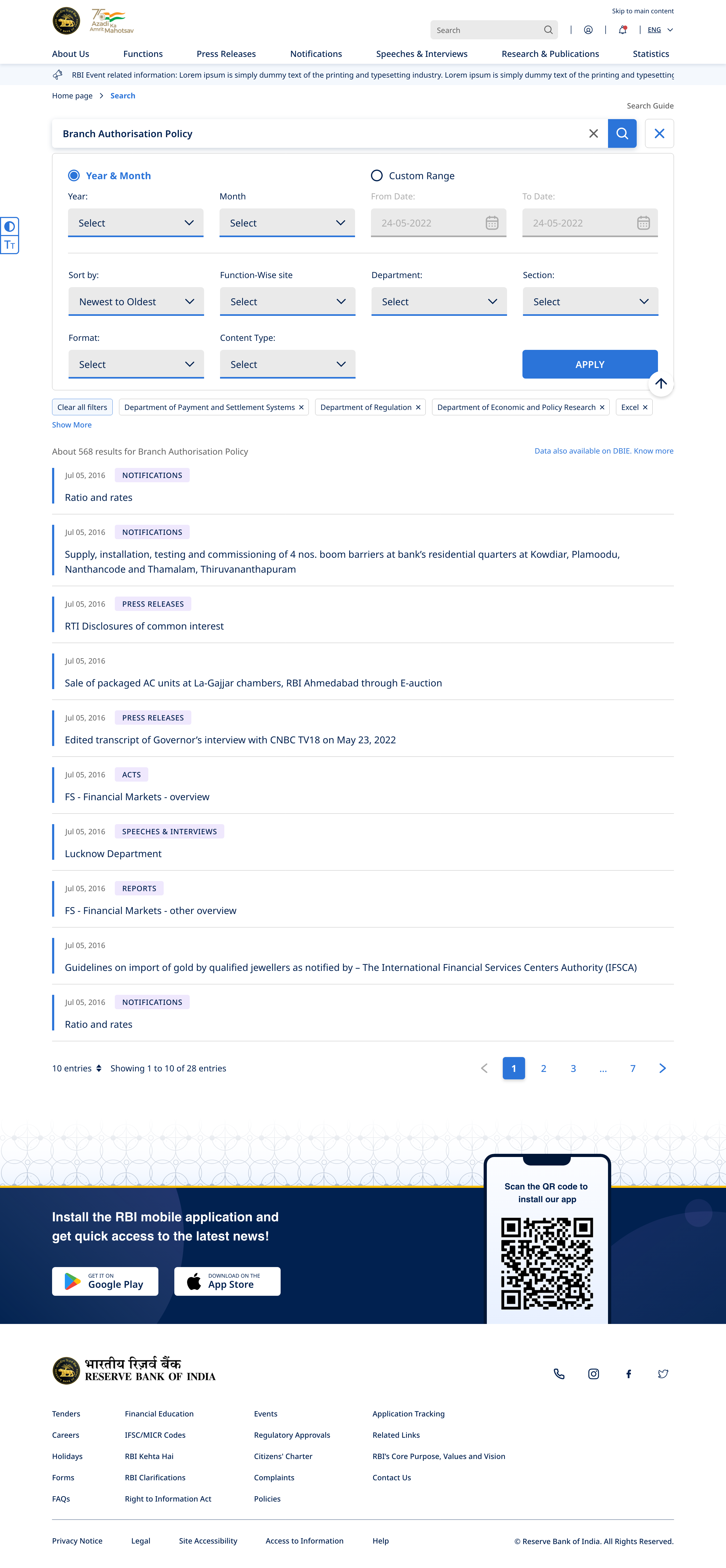
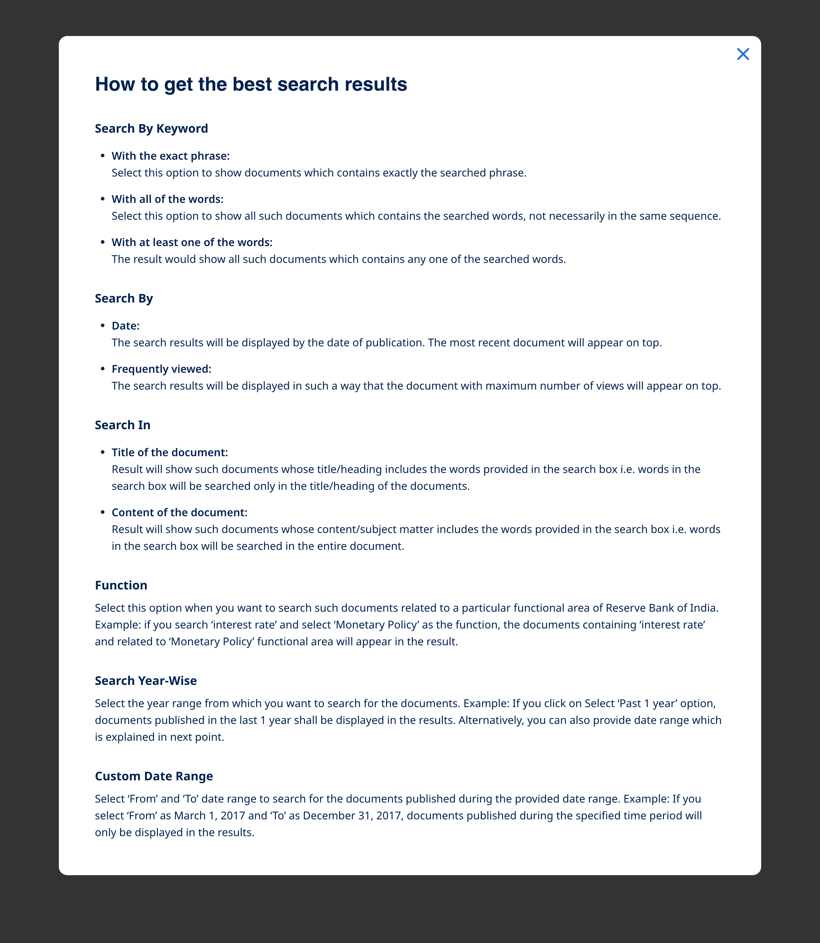
- Limited content discoverability is a significant experiential challenge, as it hinders the easy location of relevant information.
- There is a deficiency in experiential enhancements, as the user interface is considered outdated and impedes an engaging experience.
- The overall usability and responsiveness are suboptimal despite the RBI's reputation as a comprehensive and credible financial information source.
- To alleviate cognitive loads, content redesign is necessary.
- The branding doesn't match the esteemed status of an apex financial institution.
- The website is perceived as a static repository of information, and users maintain a purely transactional relationship with it.
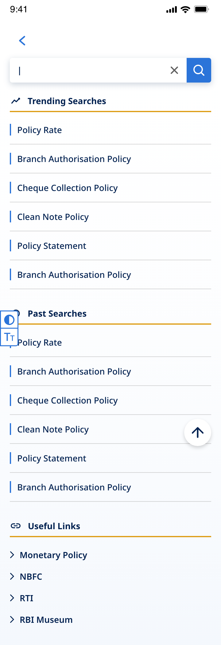
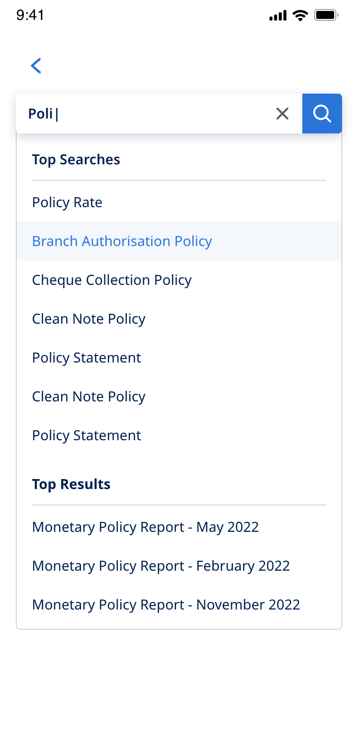
Information Architecture
REWIRING THE SITE MAP
Considering the multitude of 60+ websites and web pages, we decided that the most effective approach for transitioning into the design phase was to compile a list of Jobs to Be Done (JTBD) for each website, thus establishing a convention for primary and secondary navigation.
We also established overarching principles to be applied consistently across all websites, ensuring ease of navigation and content consumption.

Low-Fidelity Prototyping

DESIGN PROCESS
To initiate the design phase, we segmented the website drops and tranches into four distinct phases. Following this, our next move was to compile a comprehensive unique page count list for templates. We integrated industry best practices derived from design and user research into the implementation process.
RAPID SKETCHES
Utilizing brainstorming sketches, we commenced the process of envisioning a more accessible manner of presenting content that was text-heavy and explored ways to incorporate visually appealing elements.
Mid-Fidelity Prototyping
DESIGN PROCESS
We began by crafting distinctive website experiences while simultaneously developing a design system. As co-leaders of a team consisting of ten junior designers, we delineated roles, implemented quality checks, and established troubleshooting procedures.
These prototypes served as invaluable tools in managing the fluid landscape of content design, intricate details, and other dynamic components as our design library expanded.
TESTING
We carried out numerous testing iterations involving both stakeholders and users, with the aim of improving the design, information architecture, layout, and visual aesthetics.
CLIENT FEEDABCK
Our design revisions consistently integrated client feedback on a regular basis.
We carried out numerous testing iterations involving both stakeholders and users, with the aim of improving the design, information architecture, layout, and visual aesthetics.
CLIENT FEEDABCK
Our design revisions consistently integrated client feedback on a regular basis.
Interactive Mid-fi Prototypes


A/B Testing
USER TESTING
We evaluated two separate visual identities and prototypes of the same pages, carefully considering the insights gained from user feedback and RBI’s project goals.
USER FEEDBACK
We evaluated two separate visual identities and prototypes of the same pages, carefully considering the insights gained from user feedback and RBI’s project goals.
USER FEEDBACK
- While the client favored the lavender option, users expressed concerns that it conveyed a colonial influence, and the royal associations of purple seemed to contradict the organization's democratic and patriotic values.
- Blue deeply resonated with the users and the brand of RBI validating color psychology.
VISUAL IDENTITY
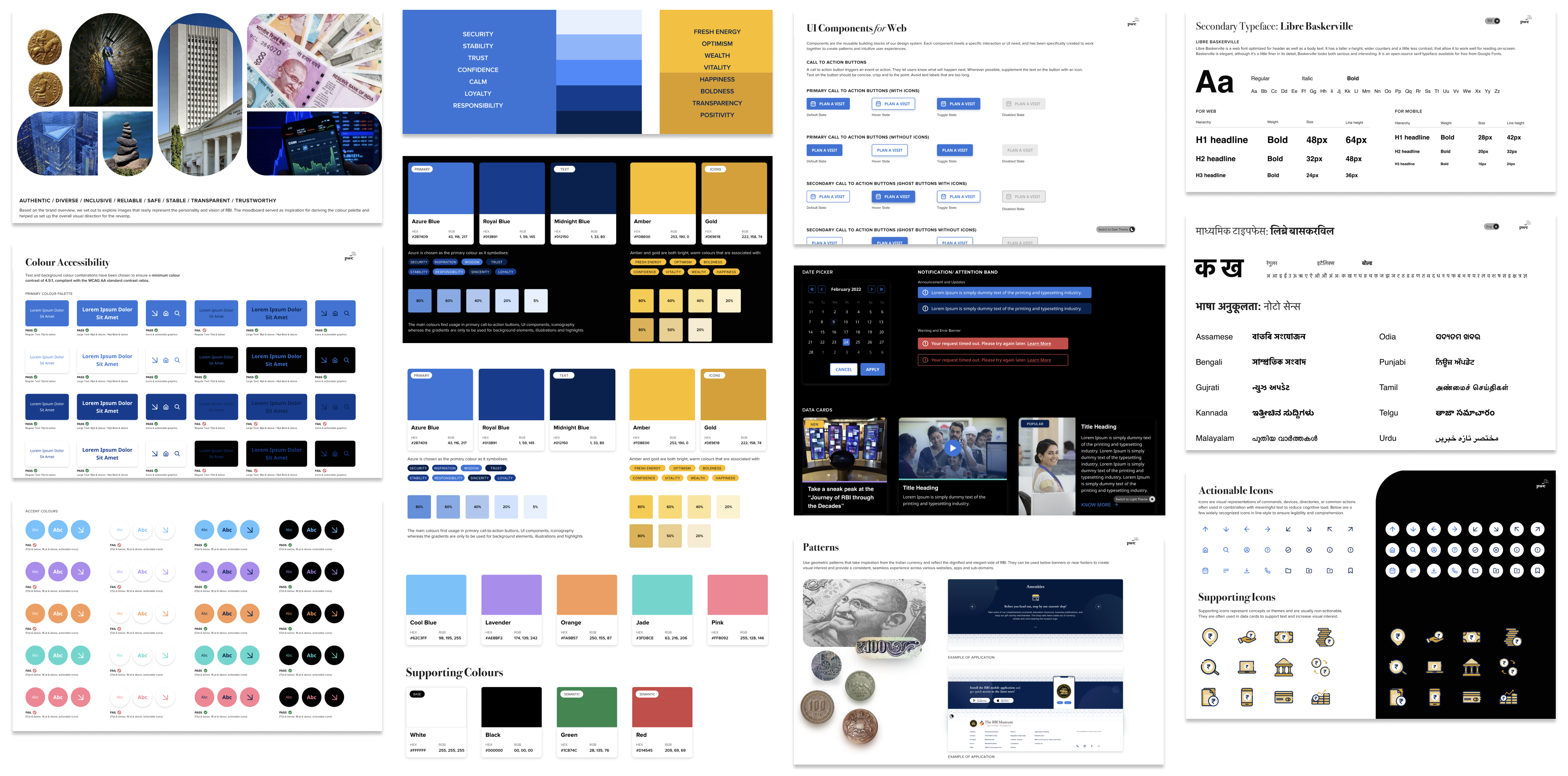
We extended the blue theme following outlined procedures, focusing on five key principles:
Additionally, we integrated a dark theme, ensured color accessibility with a minimum contrast ratio of 4.5:1, and implemented fonts suitable for multiple languages.
Custom illustrations, icons, and patterns inspired by both old and new currency were included.
We extended the blue theme following outlined procedures, focusing on five key principles:
- achieving a refreshed look,
- ensuring accessibility,
- enhancing user-friendliness,
- promoting uniformity, and
- delivering visual appeal.
Additionally, we integrated a dark theme, ensured color accessibility with a minimum contrast ratio of 4.5:1, and implemented fonts suitable for multiple languages.
Custom illustrations, icons, and patterns inspired by both old and new currency were included.
PROCESS
Through heuristic analysis, competitive benchmarking, and brand positioning, we delved into color psychology and mood boarding to inform our design decisions. We developed custom components for the design system, enriching the design library with illustrations, icons, and images for visual intrigue.
Research on color psychology showed that blue conveys confidence, safety, and trust, vital for financial institutions.
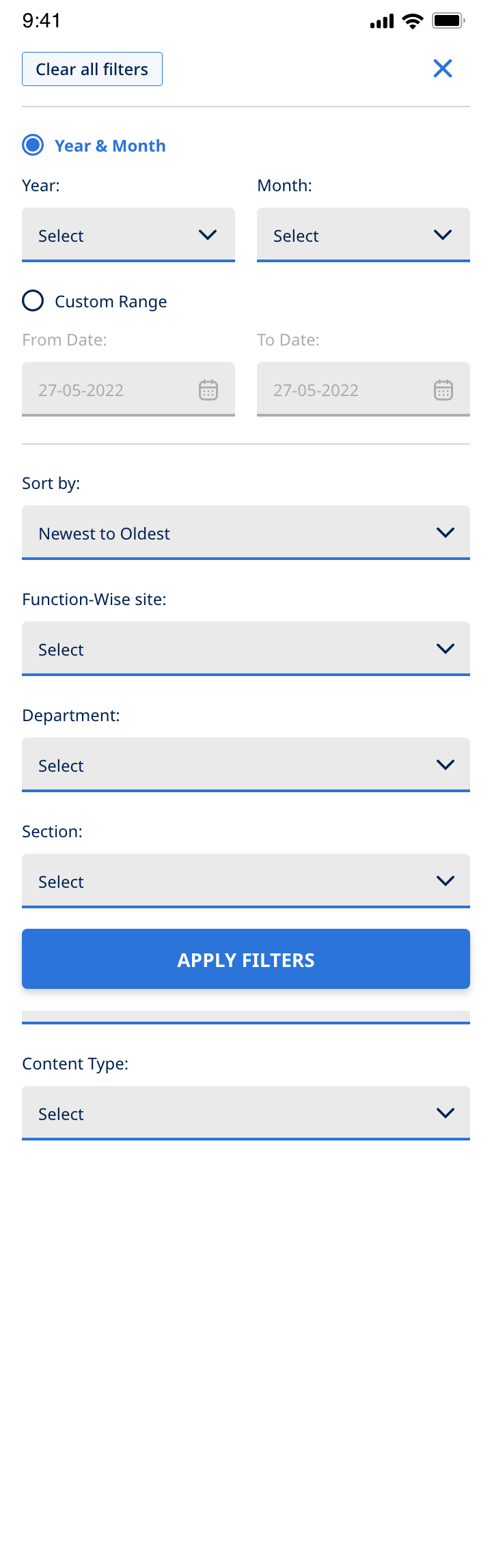
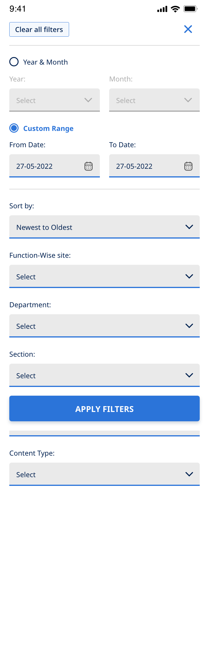
Visual Design
High-Fidelity Prototyping
FINAL OUTCOME
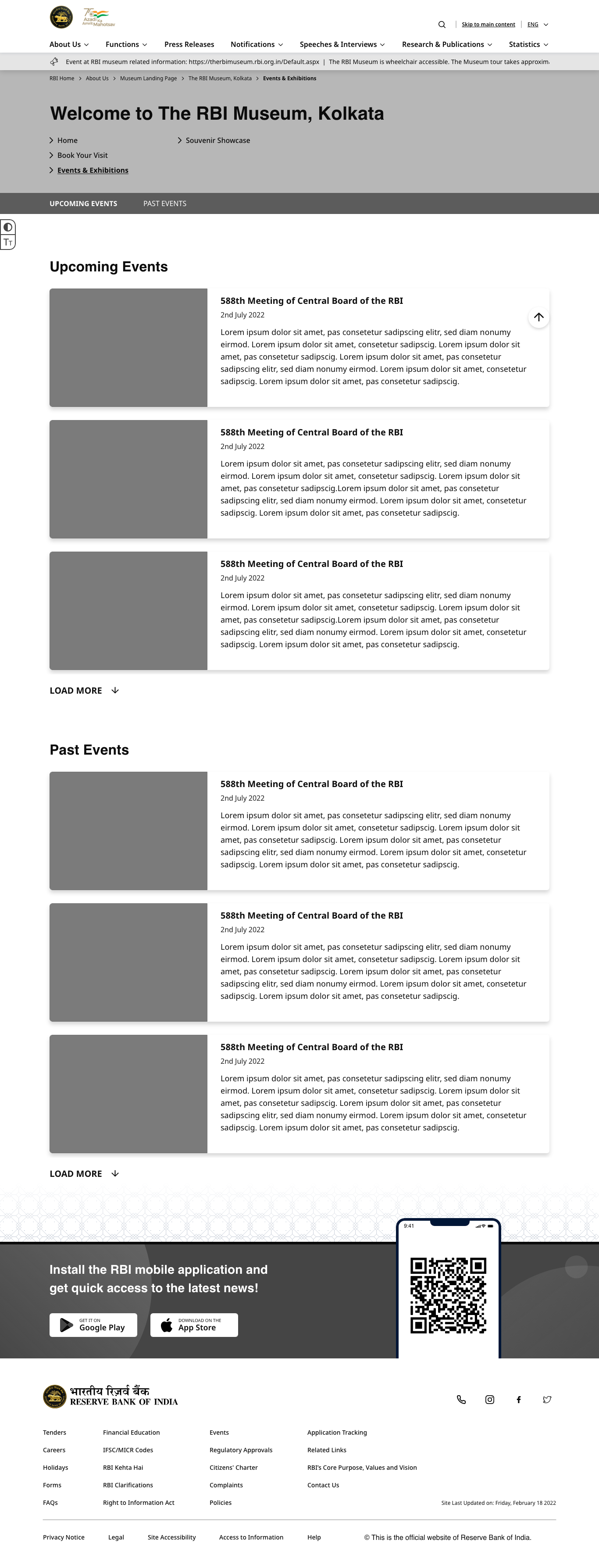
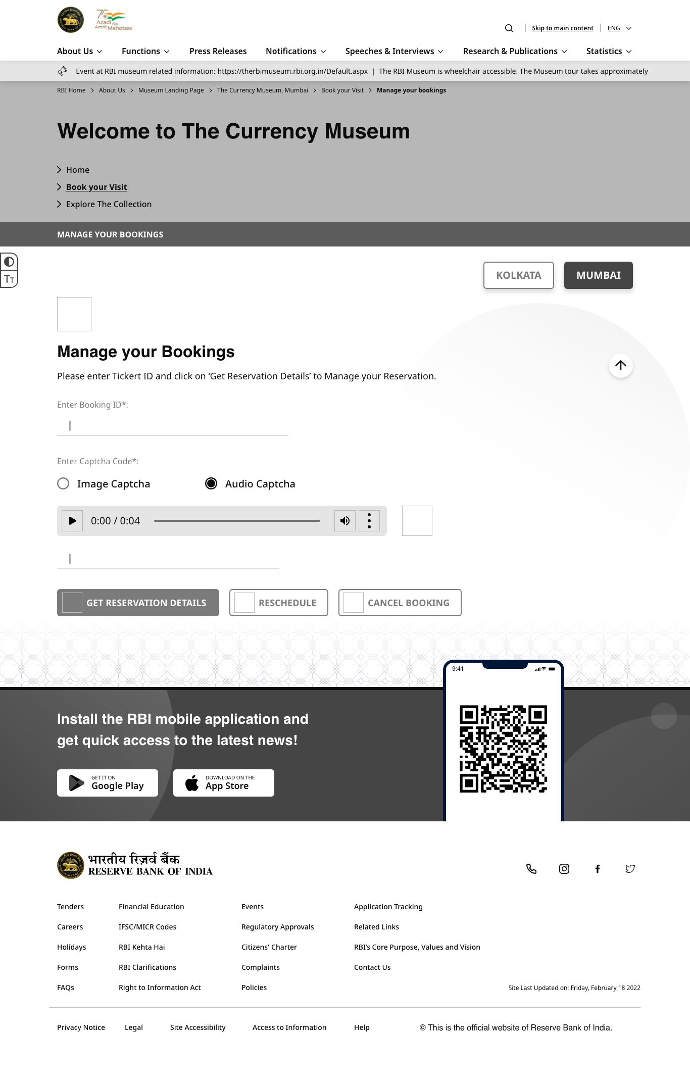
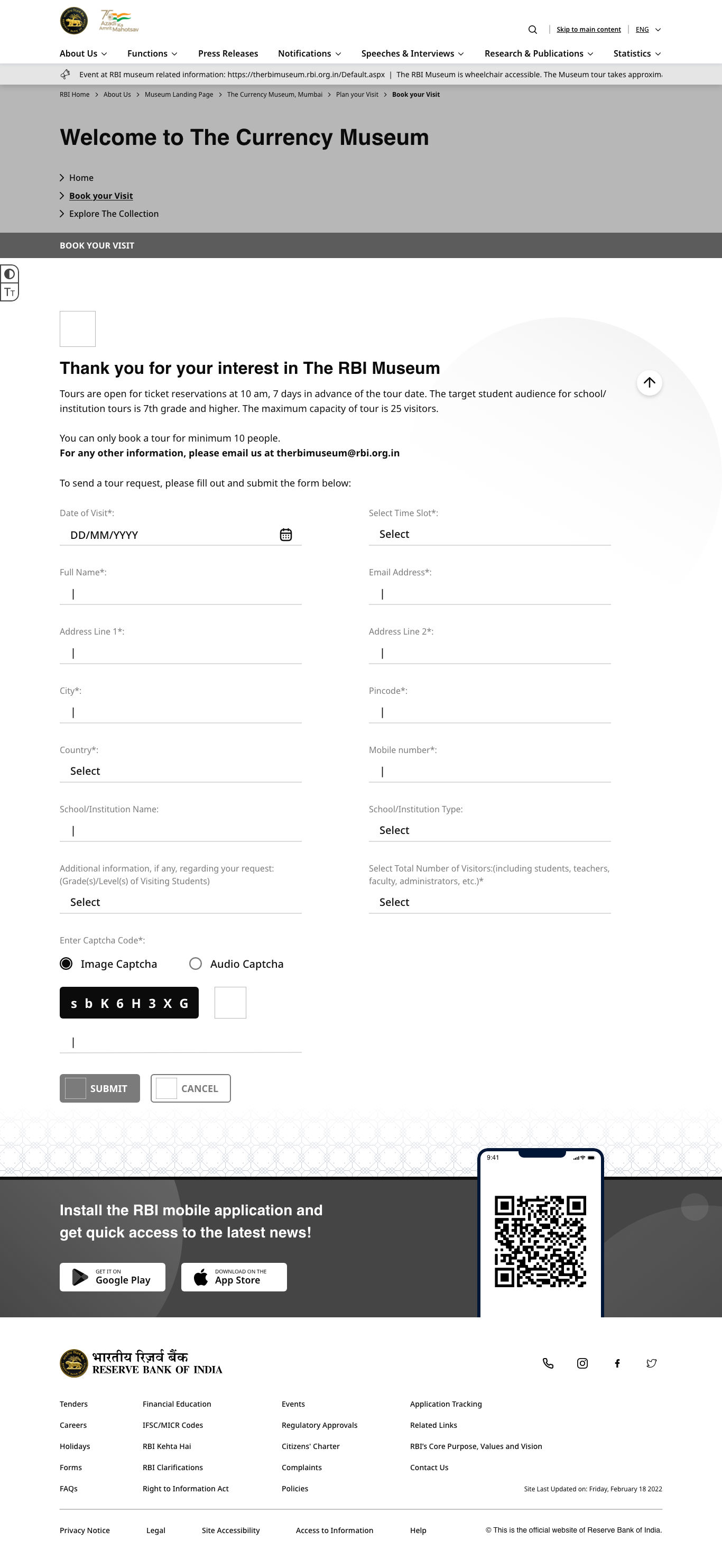
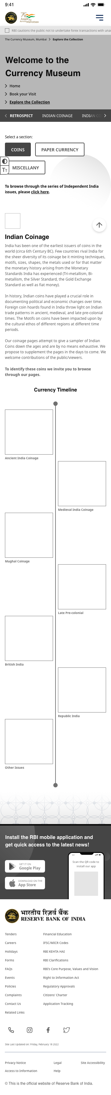
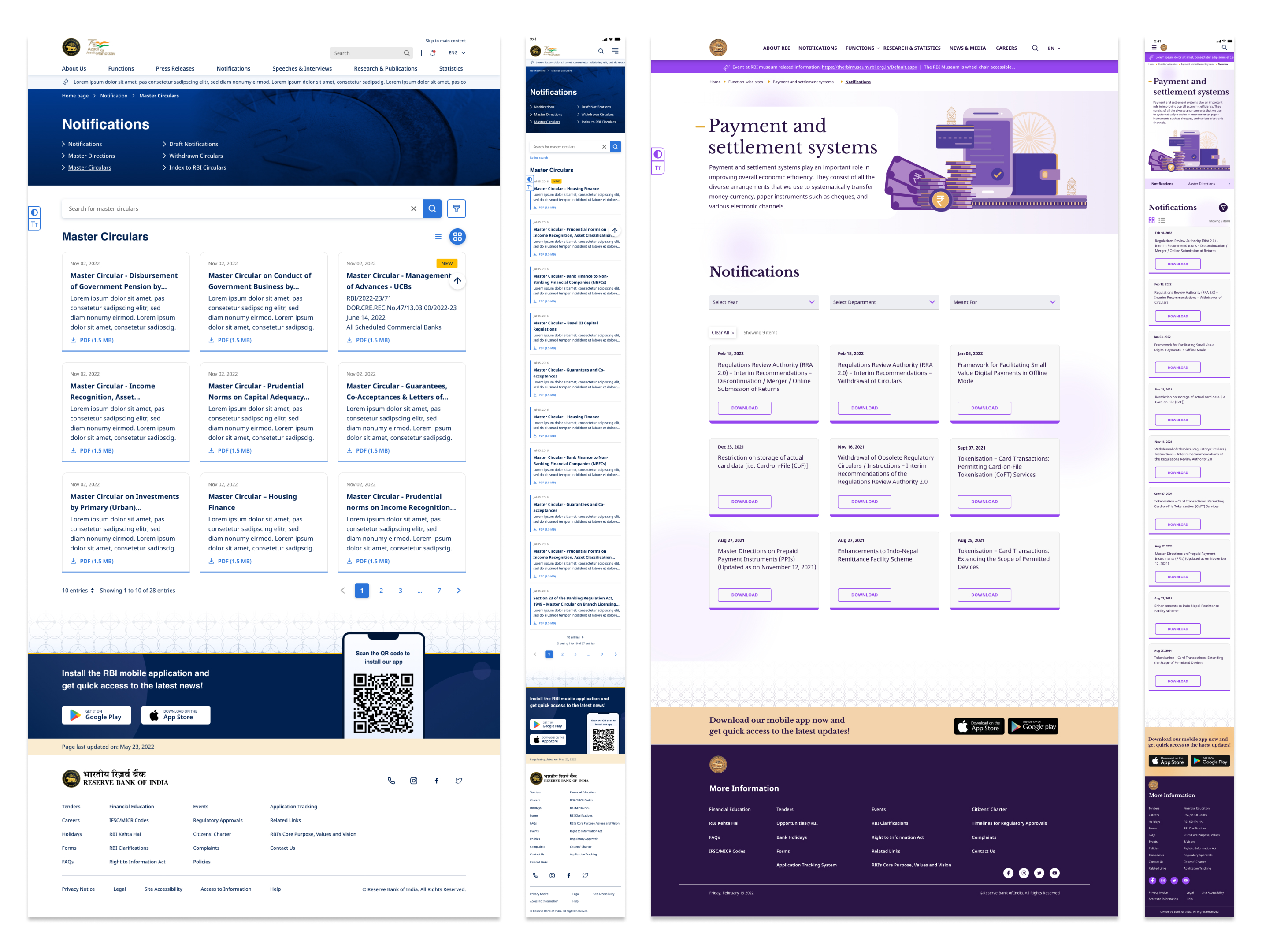
The result was a contemporary, inclusive, and engaging design that prioritized accessibility. Our strategy included implementing elements like accordions, cards, pagination, and carousels, among other fixes. These measures effectively lightened the load on the user, enhancing the dissemination of information and delivering an overall enjoyable user experience.
![]()
![]()
The result was a contemporary, inclusive, and engaging design that prioritized accessibility. Our strategy included implementing elements like accordions, cards, pagination, and carousels, among other fixes. These measures effectively lightened the load on the user, enhancing the dissemination of information and delivering an overall enjoyable user experience.


Reflections
DEVELOPMENT HANDOVER
Taking on a project of this scale for the first time, the most daunting challenge was finding a harmonious equilibrium between design requirements and the development constraints related to components, page layouts, spacing, breakpoints, and so on, despite having a foundation in coding. Nevertheless, I gained invaluable experience in designing and effectively delivering large-scale projects.
QUALITY CONTROL
I discovered that ensuring pixel-perfect precision in everyone's designs consumed a significant amount of time and attention to detail in quality control.
TRAINING A TEAM
Regular check-in stand-up meetings and open communication were instrumental in my co-leadership of this project within a novel work setting. Utilizing internal team trackers and stand-up sessions proved to be a significant time-saving strategy!