
Redefining the user experience of Tutor Oriel, a tutoring service to increase the rate of customer retention.
A tutoring service facing imminent closure after a year in operation. With a focus on developing a cohesive brand identity, refining business strategy, and creating an engaging user experience, the aim was to optimize conversions and foster retention among both students and teachers.
Problem
GRASPING BUSINESS MODELS
Tutor Oriel launched its online platform approximately a year ago, encountering low completion rates. Numerous complaints and negative social media reviews have surfaced, citing the confusing nature of the process. The business is currently facing challenges, with many tutors contemplating leaving due to a lack of clients. There is a prevalent sentiment that the experience does not align with the brand image.
Tutor Oriel launched its online platform approximately a year ago, encountering low completion rates. Numerous complaints and negative social media reviews have surfaced, citing the confusing nature of the process. The business is currently facing challenges, with many tutors contemplating leaving due to a lack of clients. There is a prevalent sentiment that the experience does not align with the brand image.

Project Goals
UNPACKING THE PROBLEM
- Revamp the signup process, form design, and user touchpoints for accessing the application, with the aim of establishing an engaging and swift subscription process that fosters high conversion rates.
- Reimagine the brand to better reflect the business and team values.
Hypothesis
FREEMIUM SIGN-UP MODEL HAS PROVEN TO BE SUCCESSFUL
To boost conversions, Tutor Oriel can deploy a freemium acquisition model and refine the design to enhance customer acquisition and completion. To minimize bounce rates, consider segmenting the signup/enrollment application into sections, enabling users to focus on specific information regarding tutors, classes, scheduling, payment, etc. Separate login/signup and enrollment processes to streamline actions and flows. The signup can initiate a free account with newsletters/updates, while the enrollment form seamlessly guides users to the payment plan. This approach allows first-time users to familiarize themselves with services, explore a free class session, or prepare for future enrollment at their own pace.
To boost conversions, Tutor Oriel can deploy a freemium acquisition model and refine the design to enhance customer acquisition and completion. To minimize bounce rates, consider segmenting the signup/enrollment application into sections, enabling users to focus on specific information regarding tutors, classes, scheduling, payment, etc. Separate login/signup and enrollment processes to streamline actions and flows. The signup can initiate a free account with newsletters/updates, while the enrollment form seamlessly guides users to the payment plan. This approach allows first-time users to familiarize themselves with services, explore a free class session, or prepare for future enrollment at their own pace.
Heuristic Analysis
ASSESSING THE CURRENT WEBSITE
Having dissected the problematic areas and comprehended the business challenges, my initial step involved evaluating the current website using the ten principles of heuristic analysis. The following principles were identified as severe issues, and solutions were devised during the design phase.
![]()
Having dissected the problematic areas and comprehended the business challenges, my initial step involved evaluating the current website using the ten principles of heuristic analysis. The following principles were identified as severe issues, and solutions were devised during the design phase.

1. AESTHETIC AND MINIMAL DESIGN {LOW}
The current design lacks refinement in terms of spacing and optimal utilization of screen space.
RECOMMENDATION
Enhancing the aesthetic appeal and ensuring a more minimalistic design can contribute to an improved user interface.
The current design lacks refinement in terms of spacing and optimal utilization of screen space.
RECOMMENDATION
Enhancing the aesthetic appeal and ensuring a more minimalistic design can contribute to an improved user interface.
2. CONSISTENCY AND STANDARDS {MEDIUM}
The design lacks adherence to standard industry conventions, particularly evident during the payment phase. This deviation may instill mistrust.
RECOMMENDATION
Ensuring consistency with established norms in the industry is vital for user confidence.
The design lacks adherence to standard industry conventions, particularly evident during the payment phase. This deviation may instill mistrust.
RECOMMENDATION
Ensuring consistency with established norms in the industry is vital for user confidence.
3. LACK OF SYSTEM STATUS VISIBILITY {HIGH}
Throughout the sign-up process, users are unable to discern which stage of the sign-up they are currently in.
RECOMMENDATION
Implementing breadcrumbs, status bars, or a timeline could provide clarity by indicating the number of steps involved in the sign-up and the user's progress leading up to the confirmation page.
4. ERROR PREVENTION {HIGH}
Forms, especially during the sign-up process, require effective error prevention measures.
RECOMMENDATION
Users should be promptly informed if their input has been accepted or if adjustments are needed to enhance the overall user experience.
Forms, especially during the sign-up process, require effective error prevention measures.
RECOMMENDATION
Users should be promptly informed if their input has been accepted or if adjustments are needed to enhance the overall user experience.
Adjacent Industry Audit
INDUSTRY STANDARDS
Udemy, Coursera, Equinox, Urban Outfitters, and Spotify serve as notable competitors in the adjacent space, boasting excellent sign-up flows and form designs. Analyzing these websites provided inspiration for Knowledgify's sign-up process, business model, form design, homepage layout, and the creation of a website that offers flexibility in payment options.
![]()
Udemy, Coursera, Equinox, Urban Outfitters, and Spotify serve as notable competitors in the adjacent space, boasting excellent sign-up flows and form designs. Analyzing these websites provided inspiration for Knowledgify's sign-up process, business model, form design, homepage layout, and the creation of a website that offers flexibility in payment options.

Brainstorming Sketches
DESIGN PHASE
Engaged in rapid sketching, information architecture, and hypothetical user journeys to comprehend potential design tactics for implementation.
![]()
![]()
![]()
Engaged in rapid sketching, information architecture, and hypothetical user journeys to comprehend potential design tactics for implementation.
- Providing users with the opportunity to explore the product and services through a trial class and freemium sign-up.
-
Determining the optimal approach to present information about tutors, pricing, and subjects to establish trust with the audience.
-
Identifying methods to offer flexibility and tools for an enhanced experience, such as a search bar, detailed tutor pages, payment summaries and options, and overall transparency.

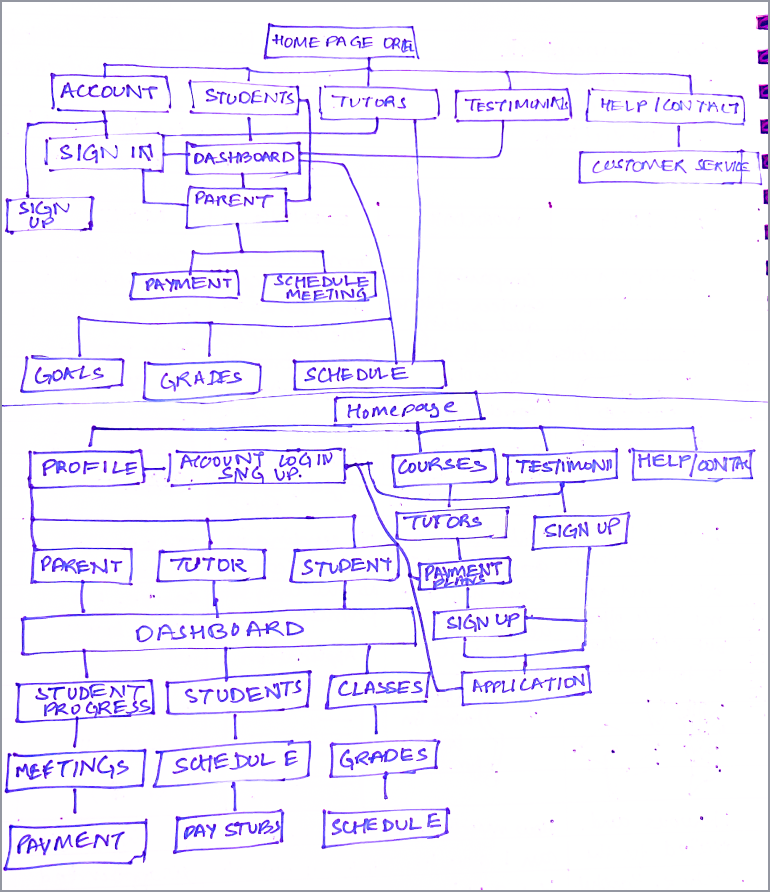
User Flows
ENVISIONING THE EXPERIENCE
Explored two flows to understand the needs of diverse users and their respective touchpoints.
FLOW 1: DIRECT PAYMENT
![]()
FLOW 2: FREEMIUM SIGN-UP
![]()
Explored two flows to understand the needs of diverse users and their respective touchpoints.
FLOW 1: DIRECT PAYMENT

FLOW 2: FREEMIUM SIGN-UP

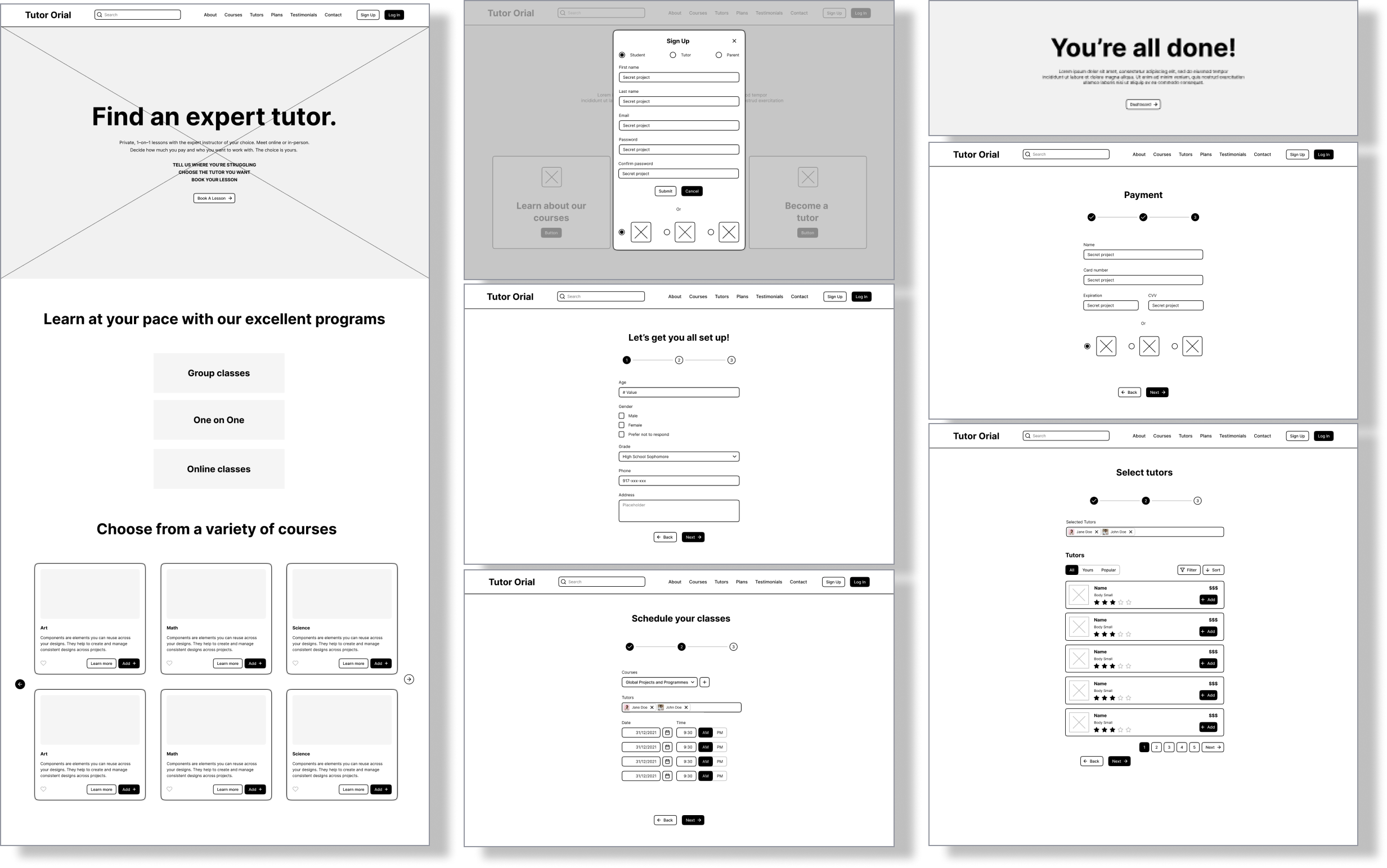
Low Fidelity Prototype
VISUALIZING CONCEPTS
Developing a compelling and detailed landing page for effective and succinct communication. Implementing multiple CTAs to seamlessly direct users towards the sign-up or subscription process. Users will have the capability to search for subjects and tutors post-informed decision-making. Furthermore, establishing an onboarding process to adeptly guide users through the intricacies of the sign-up and subscription procedures.
![]()
Developing a compelling and detailed landing page for effective and succinct communication. Implementing multiple CTAs to seamlessly direct users towards the sign-up or subscription process. Users will have the capability to search for subjects and tutors post-informed decision-making. Furthermore, establishing an onboarding process to adeptly guide users through the intricacies of the sign-up and subscription procedures.
User Testing
A/B TESTING
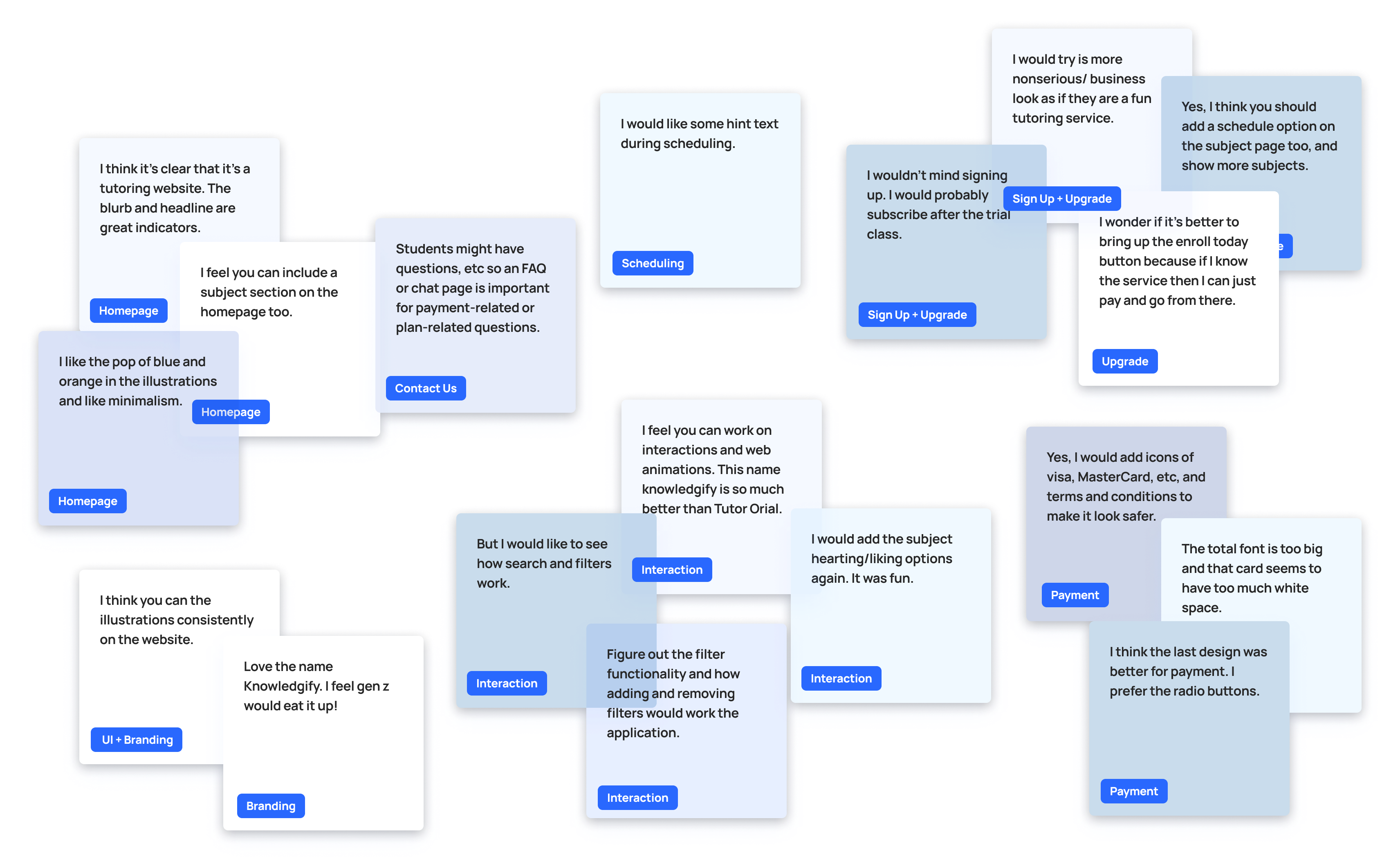
Interviewed four potential users with tutoring experience or those seeking tutoring services and tested two user flows that were previously recommended. In this A/B testing, flow 2 ranked above flow 1.
![]()
Interviewed four potential users with tutoring experience or those seeking tutoring services and tested two user flows that were previously recommended. In this A/B testing, flow 2 ranked above flow 1.

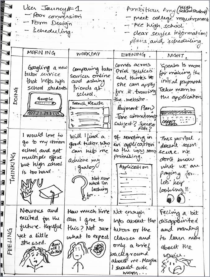
Insight Synthesis
AFFINITY MAPPING
Analyzed the interviews to identify recurring themes, patterns, and recommended changes.
![]() USER PERSONAS
USER PERSONAS
Refined the feedback into two user personas to gain a deeper understanding of the user's journey and needs.
![]()
![]()
Analyzed the interviews to identify recurring themes, patterns, and recommended changes.
 USER PERSONAS
Refined the feedback into two user personas to gain a deeper understanding of the user's journey and needs.


Mid Fidelity Prototype
DESIGNING FOR TESTING
In that phase, I experimented with the website's copy and content to align with the brand's tone and voice. I also reassessed elements like the subject wishlist, pricing model, branding, and layout. I explored various color schemes, enhanced CTAs, integrated the pricing model, and developed a comprehensive payment summary page for an optimal guided experience during user onboarding. Additionally, I incorporated feedback received, focusing on refining the trial class flow, improving the payment summary, and redesigning the account landing page. Considering user interaction, I contemplated the addition of more detailed information pages to adhere to best practices and ensured accessibility by fine-tuning the color palette.
![]()
In that phase, I experimented with the website's copy and content to align with the brand's tone and voice. I also reassessed elements like the subject wishlist, pricing model, branding, and layout. I explored various color schemes, enhanced CTAs, integrated the pricing model, and developed a comprehensive payment summary page for an optimal guided experience during user onboarding. Additionally, I incorporated feedback received, focusing on refining the trial class flow, improving the payment summary, and redesigning the account landing page. Considering user interaction, I contemplated the addition of more detailed information pages to adhere to best practices and ensured accessibility by fine-tuning the color palette.
User Testing
SECOND ROUND OF TESTING
Interviewed the same users tofurther refine the tone, look and overall experience.
![]()
Interviewed the same users tofurther refine the tone, look and overall experience.

Insight Synthesis
AFFINITY MAPPING
Analyzed the interviews to identify recurring themes, patterns, and recommended changes.
![]()
Analyzed the interviews to identify recurring themes, patterns, and recommended changes.
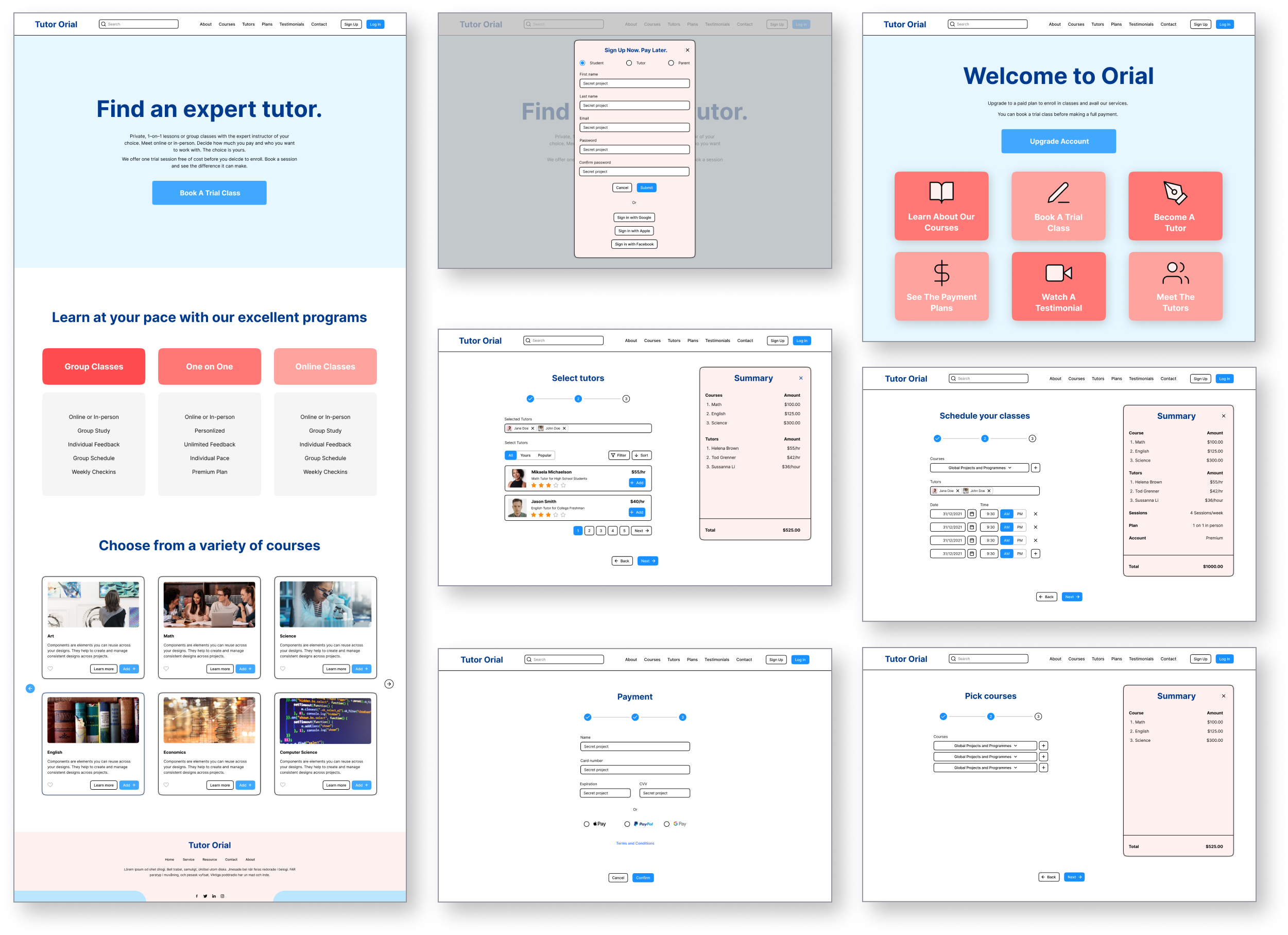
High Fidelity Prototype
WIREFRAMING
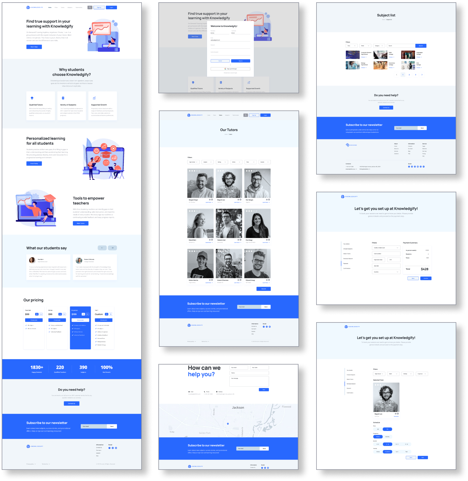
Revamped the entire Tutor Oriel website into Knowledgify, focusing on improved user experience, content, flows, features, branding, and business model. The homepage showcases relevant information, engaging illustrations, and clear CTAs. It includes a search bar, testimonials, a help section, and a footer. Users can explore subject and tutor details, sign up, subscribe, or log in. The redesigned application process simplifies sign-ups, enrollments, and newsletter subscriptions with divided, user-friendly steps. Enhanced interactions in the scheduling section guide users seamlessly to the payment page, offering multiple payment methods, secure transactions, and a summary with plan selection. The confirmation page leads to the dashboard or account homepage.
![]()
Revamped the entire Tutor Oriel website into Knowledgify, focusing on improved user experience, content, flows, features, branding, and business model. The homepage showcases relevant information, engaging illustrations, and clear CTAs. It includes a search bar, testimonials, a help section, and a footer. Users can explore subject and tutor details, sign up, subscribe, or log in. The redesigned application process simplifies sign-ups, enrollments, and newsletter subscriptions with divided, user-friendly steps. Enhanced interactions in the scheduling section guide users seamlessly to the payment page, offering multiple payment methods, secure transactions, and a summary with plan selection. The confirmation page leads to the dashboard or account homepage.
Visual Identity
LOGO DESIGN
![]()

BRANDING
To spread knowledge among others.
Knowledgify, a contemporary slang term conveying the essence of disseminating knowledge, was chosen for its catchy and appealing nature, particularly targeting young college students and high school teenagers.
Specializing in connecting students with fun and friendly tutors, Knowledgify embodies the lively and youthful energy of Tutor Orial's original vision and brand. The logo symbolizes mental growth, brain power, and learning tools that foster a student's development into a competitive high-ranking individual. It represents the sharp minds young students possess and positions Knowledgify as a supporter, cultivator, and facilitator of these brilliant brains.
TYPOGRAPHY
![]()

TYPE: MANROPE
Manrope is a contemporary grotesque font family, an open-source creation by Mikhail Sharanda. Originally released in 2018, it became part of Google Fonts in 2020. This sans-serif typeface offers seven weights and a variable font version. Manrope utilizes OpenType features, ensuring automatic correction of apostrophes.
With broad language support encompassing most Latin and Cyrillic languages, Manrope provides not only alternative glyphs for uppercase styles but also context-sensitive features. Particularly suitable for interface design and numeric data, the font's digits are ideal for various applications like phone numbers, card numbers, and watch faces.
ENSOME DESIGN SYSTEM︎︎︎
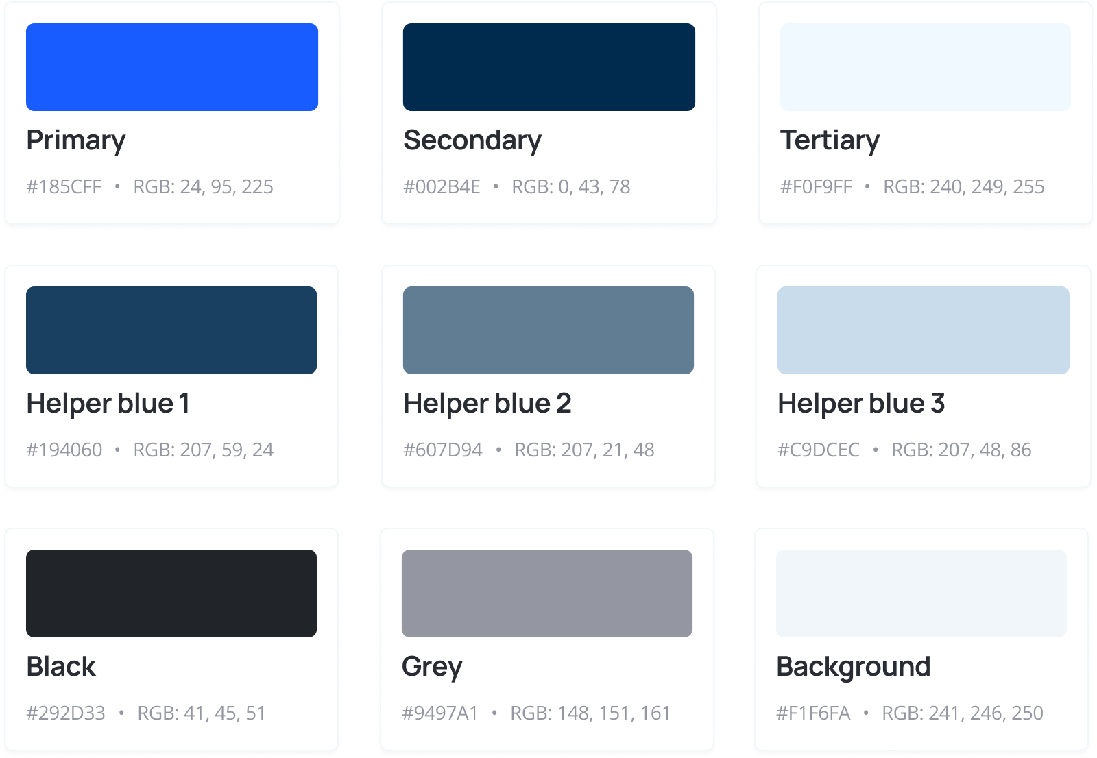
COLOR PALATTE
![]()
WORLD’S FAVORTIRE COLOR
The primary blue shade is derived from Ultramarine, offering an industrial and fashion-forward aesthetic. Studies show that individuals are 15% more inclined to engage with businesses that use blue in their branding compared to warmer colors. This preference may be attributed to the positive impact of the color on one's well-being. Statistically, blue is the most liked color, associated with traits such as trust, peace, loyalty, competence, depth, and calm.
ACCESSIBILITY
Blue stands out as the safest color across all age groups, particularly for individuals aged 70+. This preference may be attributed to the fact that most people perceive the color blue more clearly than any other hue, even individuals with color-vision deficiencies.
![]()
Blue stands out as the safest color across all age groups, particularly for individuals aged 70+. This preference may be attributed to the fact that most people perceive the color blue more clearly than any other hue, even individuals with color-vision deficiencies.

Interactive Prototypes
Project Roadmap
![]()
Project Roadmap
