
LBMS
Establishing the digital presence for a London-based NGO
Let’s Build My School, an architectural team committed to constructing sustainable schools in African villages, utilizes innovative building methods and educates local communities on architecture. Approaching the completion of their first project, they aimed to expand their practice through the creation of an official NGO website and brand presence with the aim of boosting donations and volunteer engagement.LONDON
2018
2018
Role
User Researcher
UX/UI Designer
User Researcher
UX/UI Designer
Team
Abhinav Jain
Abhinav Jain
Timeline
3 Months
3 Months
Deliverables
User Research
Visual Design
Content Design
Web Design
User Research
Visual Design
Content Design
Web Design
Tools
Adobe CC
Adobe CC
Problem
DESIGNING A BRAND
LBMS stood at the brink of rapid expansion, with their first project nearing completion and several more in the pipeline. However, liquidity challenges arose as they lacked a distinct organizational identity. Their online presence was confined to a single-page website, displayed on the right. These architects were keen on establishing a compelling brand identity.
LBMS stood at the brink of rapid expansion, with their first project nearing completion and several more in the pipeline. However, liquidity challenges arose as they lacked a distinct organizational identity. Their online presence was confined to a single-page website, displayed on the right. These architects were keen on establishing a compelling brand identity.

Project Goals
BRIEF
- Create a brand identity that effectively communicates the charity's mission, vision, and transformative impact.
- Develop a website that attracts donors, generates funds, and entices volunteers for construction trips to various locations.
- Enhance conversions through strategically placed "Join Us" and "Donate" buttons.
- Construct a website with compelling content that explores the brand's narrative and highlights its proven impact, thereby driving brand awareness.
- Create brand awareness by redesigning social media content and messaging.
The Process
SETTING A TIMELINE
Outlined the primary stages of the project to grasp the timeline, allowing room for feedback and revision rounds. This aided in envisioning the planning and execution needed to deliver a live website along with social media launch campaign.
![]()
Outlined the primary stages of the project to grasp the timeline, allowing room for feedback and revision rounds. This aided in envisioning the planning and execution needed to deliver a live website along with social media launch campaign.

Desk Research
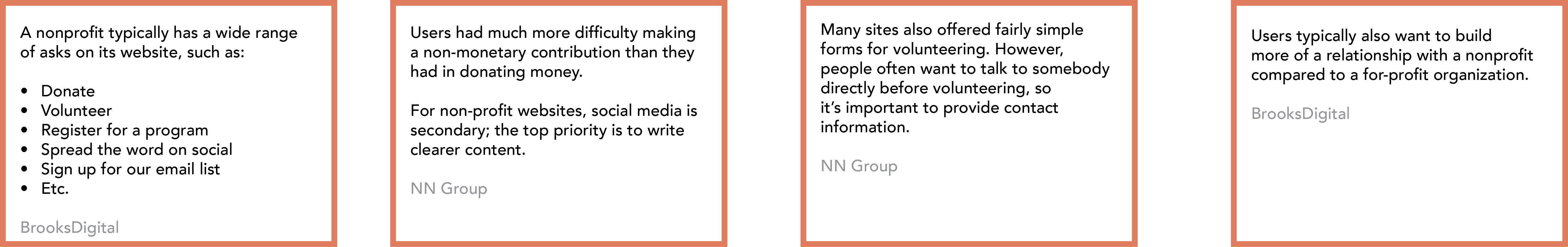
GUIDING FRAMEWORK
This approach served as a foundation for designing a non-profit. It facilitated the discovery of user insights and industry trends, translating them into the organization's brand language and content across all platforms and communications.
![]()
This approach served as a foundation for designing a non-profit. It facilitated the discovery of user insights and industry trends, translating them into the organization's brand language and content across all platforms and communications.
Competitive Analysis
BRAND POSITIONING
Explored numerous NGO brands that inspired the founder, seeking to establish a voice, tone, and appearance that not only reflected LBMS's values but also distinguished it. Our assessment encompassed a thorough comparison of logo designs, brand identities, content strategy, and messaging.
![]()
Explored numerous NGO brands that inspired the founder, seeking to establish a voice, tone, and appearance that not only reflected LBMS's values but also distinguished it. Our assessment encompassed a thorough comparison of logo designs, brand identities, content strategy, and messaging.

Brand Keywords
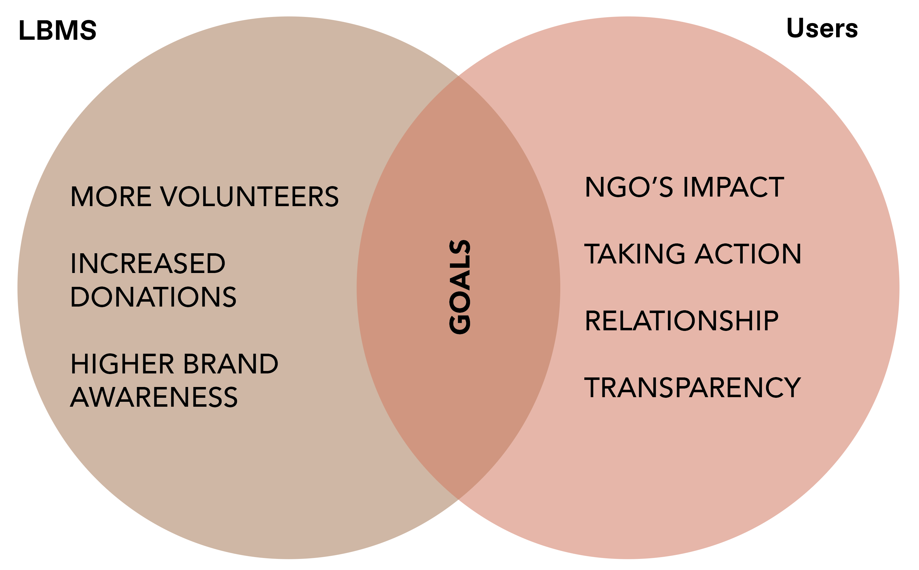
SETTING A TONE
Engaging with stakeholders, past volunteers, and donors, I examined various themes and identified patterns that dictated the design strategy, culminating in the word cloud below.
![]()
Engaging with stakeholders, past volunteers, and donors, I examined various themes and identified patterns that dictated the design strategy, culminating in the word cloud below.

Information Architechture
MAPPING THE WEBISTE
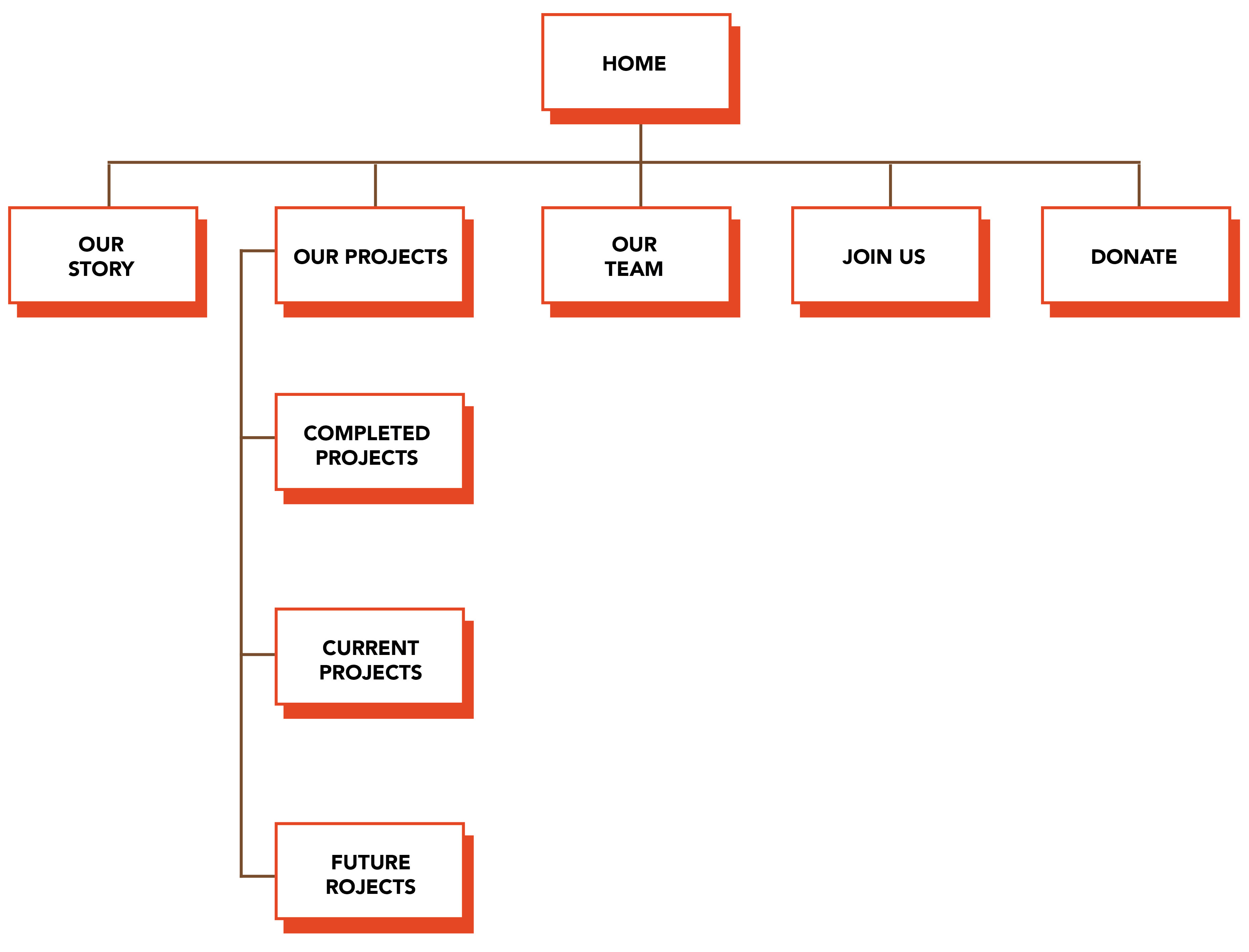
The website needed to be compact and focused in terms of both the number of pages and the information it conveyed. It remained crucial to allocate each essential element to its dedicated page, moving away from the one-page structure. A quick card sorting exercise pushed this along. This strategy ensured that projects had their own dedicated space, with information easily accessible through the main navigation and action buttons. The aim was to prioritize high visibility of information and ensure quick readability.
![]()
The website needed to be compact and focused in terms of both the number of pages and the information it conveyed. It remained crucial to allocate each essential element to its dedicated page, moving away from the one-page structure. A quick card sorting exercise pushed this along. This strategy ensured that projects had their own dedicated space, with information easily accessible through the main navigation and action buttons. The aim was to prioritize high visibility of information and ensure quick readability.
Prototyping
RAPID SKETCHING
Following the development of the site map, the content hierarchy needed sorting. Quick sketching enabled us to comprehend which layouts showcased the content most effectively and how we could leverage the existing Squarespace templates.
Following the development of the site map, the content hierarchy needed sorting. Quick sketching enabled us to comprehend which layouts showcased the content most effectively and how we could leverage the existing Squarespace templates.

User Testing
FEEDBACK REVISIONS
Leveraging Squarespace enabled us to initiate the testing process early, allowing us to discern what works well and identify areas that require further attention.
Leveraging Squarespace enabled us to initiate the testing process early, allowing us to discern what works well and identify areas that require further attention.
"The navigation was clear and easy to understand."
"The provided information illustrates how and why the organization is functioning, and the numbers are a great touch too!"
"The photos exude great energy, and I can see the value you add to the location while working with the locals."
"The CTA is clear and prominent but not obnoxiously in the face, which I appreciate. You give the user a chance to browse and learn."
"I can observe a significant change in the before and after of the website. It remains simple and concise. Great job!"
"The logo brings out the personality."
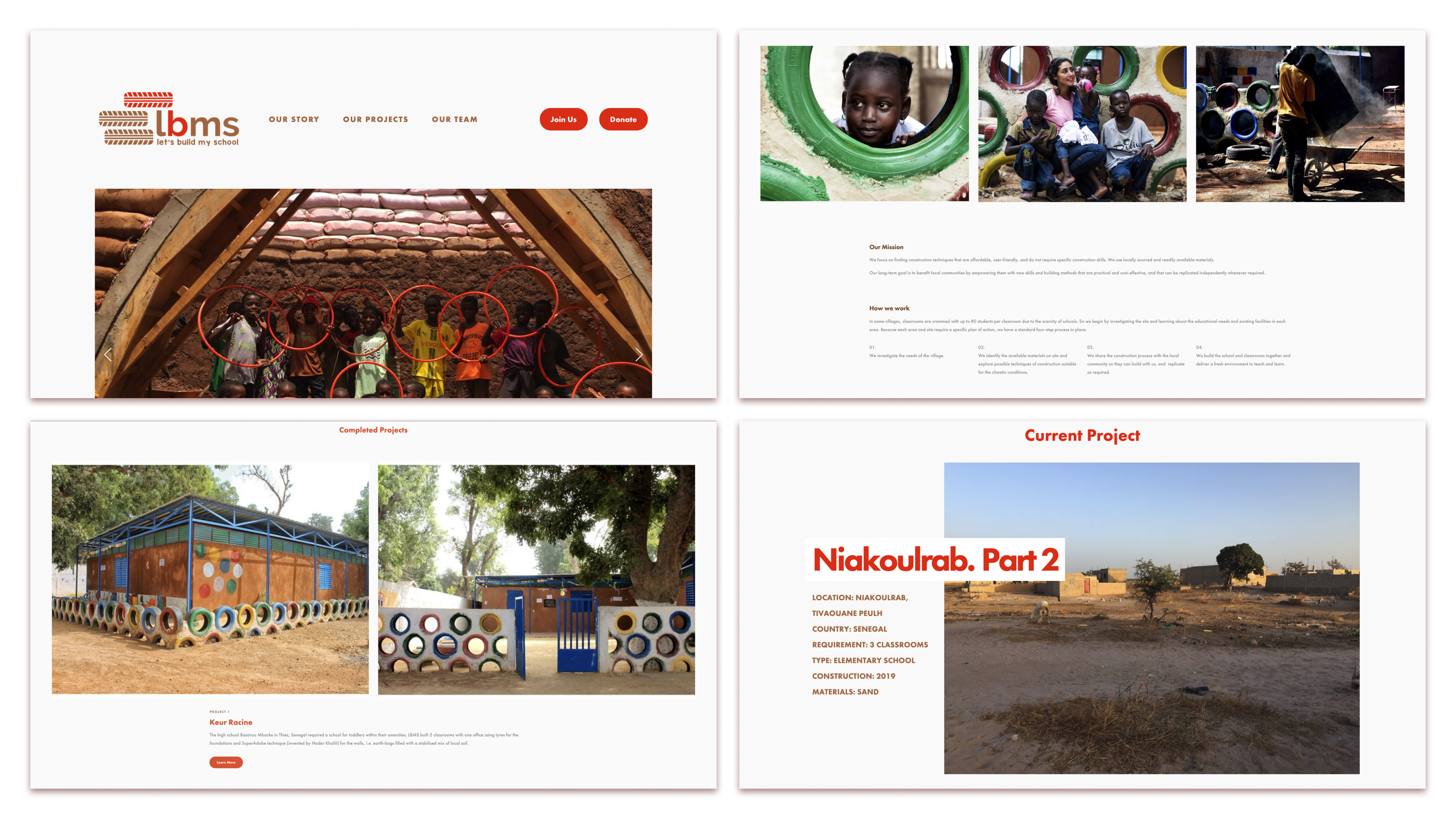
Website Design
FINAL OUTCOME
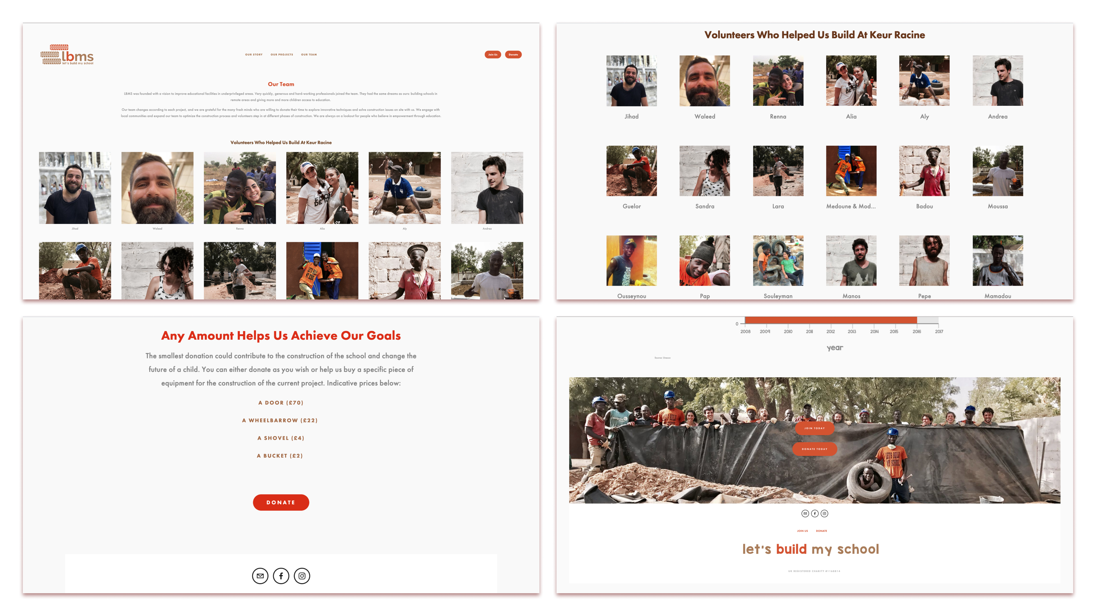
Created a lively and engaging website that communicates the impact and aspirations of the NGO.
![]()
![]()
Created a lively and engaging website that communicates the impact and aspirations of the NGO.


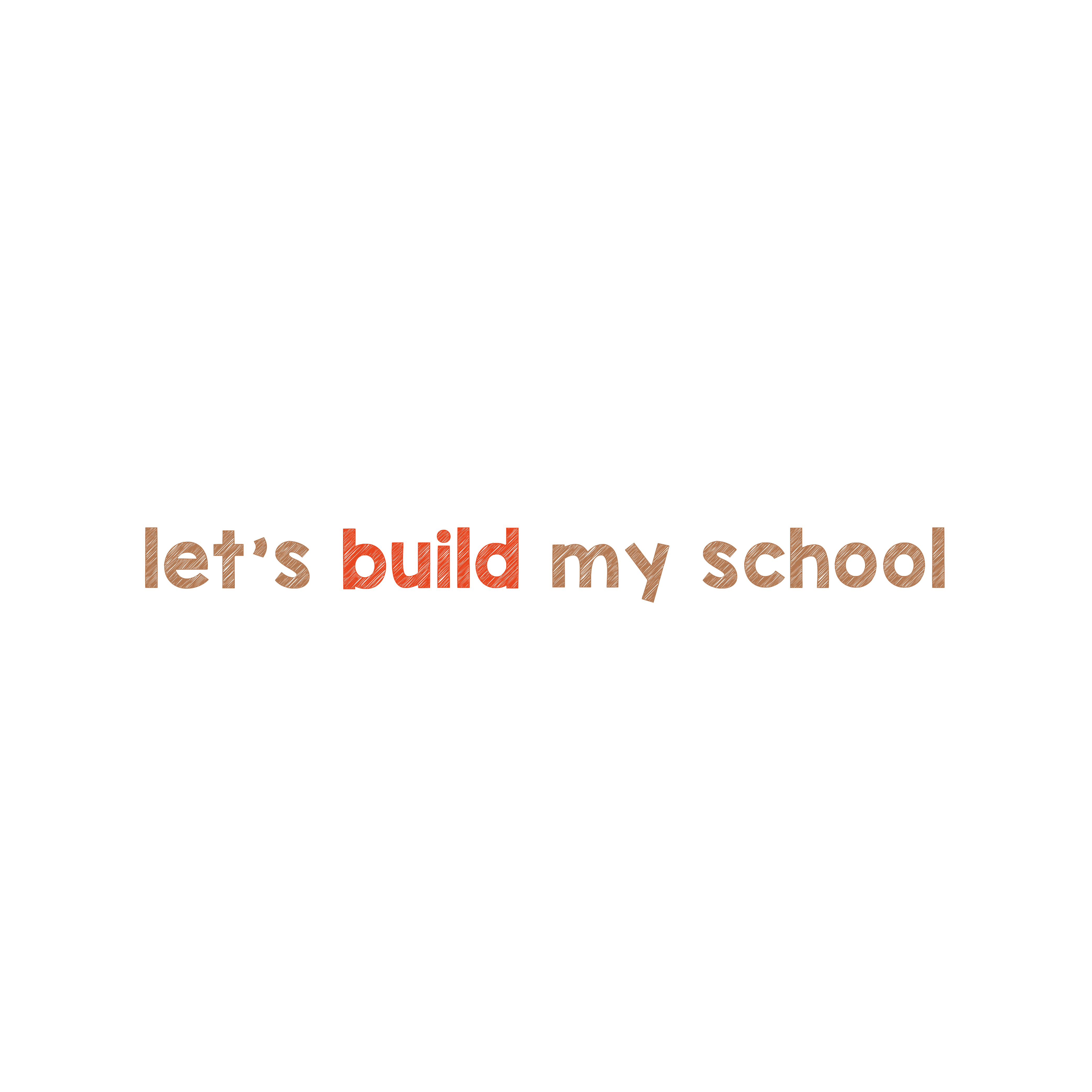
Logo Exploration
BRINGING THE BRAND TO LIFE
Drawing inspiration from construction motifs, previous volunteer trips, African colors, and culture, I approached logo design with an organic touch, utilizing earthy, vibrant, and natural colors. Opting for a hand-drawn type, my intention was to evoke the sense of raw terrain in schools, chalks, blackboards, and all the colorful elements that bring joy to a child's learning.
![]()
![]()
![]()
![]()
![]()
![]()
![]()
![]()
Drawing inspiration from construction motifs, previous volunteer trips, African colors, and culture, I approached logo design with an organic touch, utilizing earthy, vibrant, and natural colors. Opting for a hand-drawn type, my intention was to evoke the sense of raw terrain in schools, chalks, blackboards, and all the colorful elements that bring joy to a child's learning.
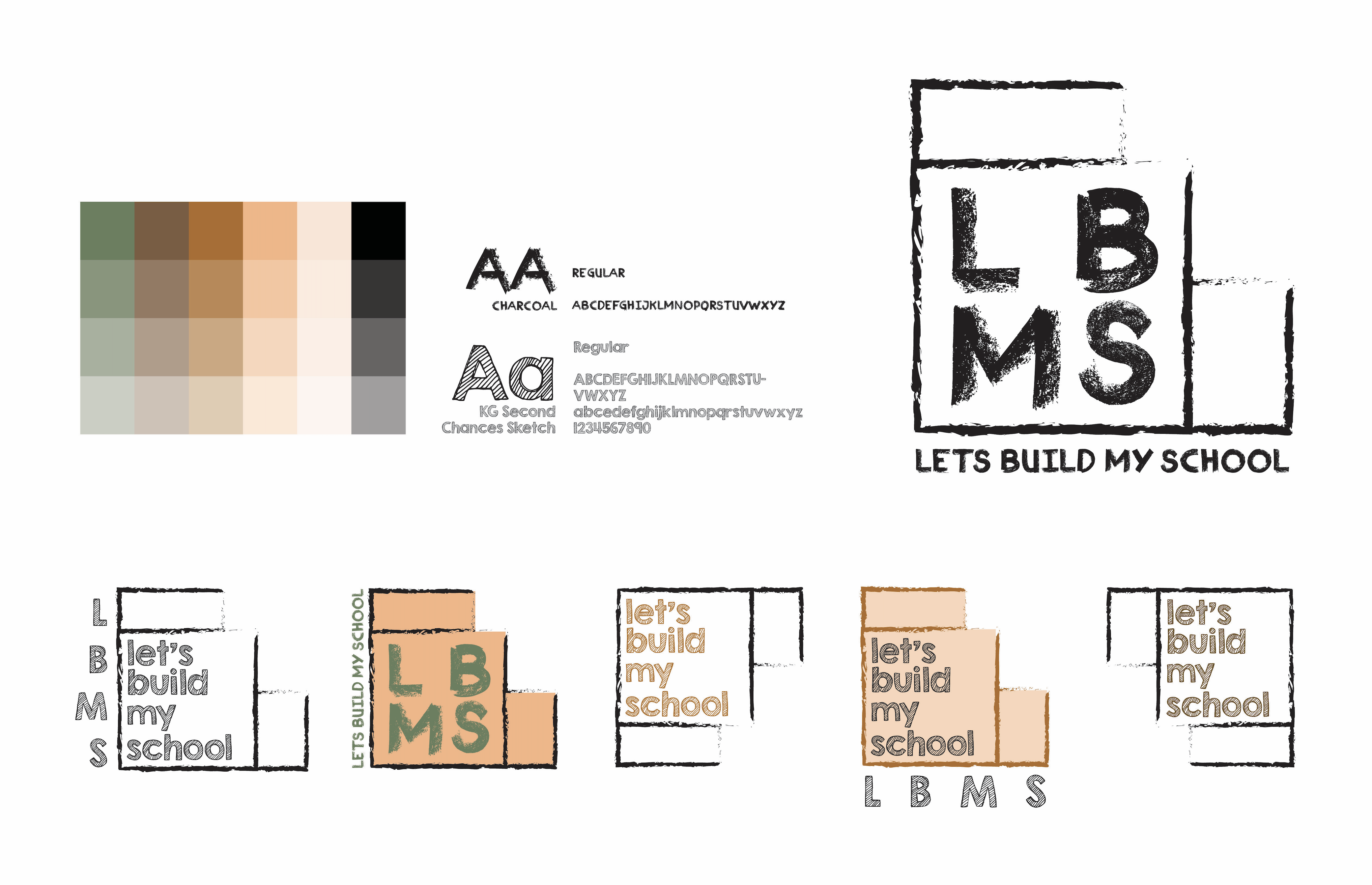
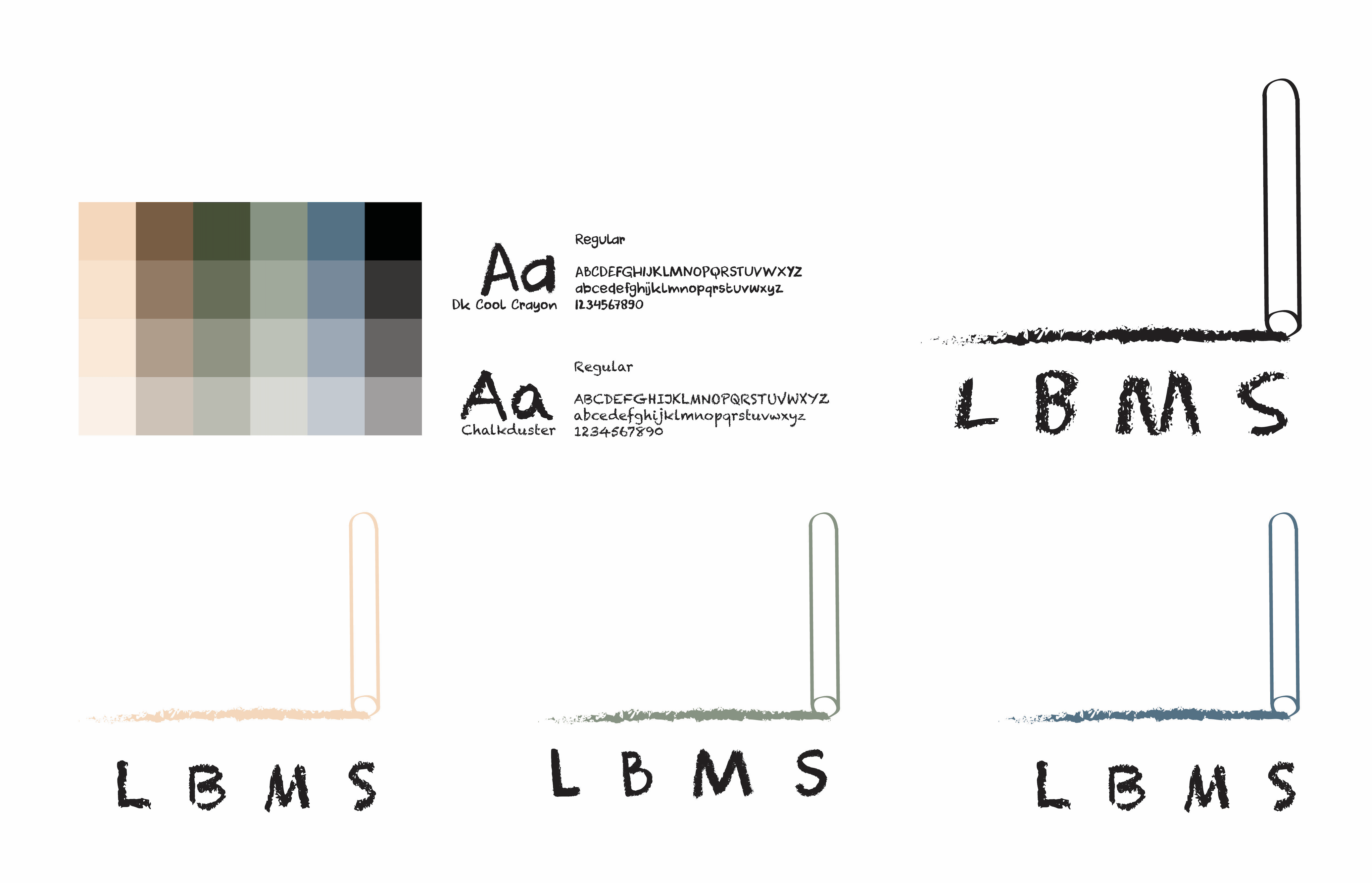


Visual Design
PRIMARY LOGO
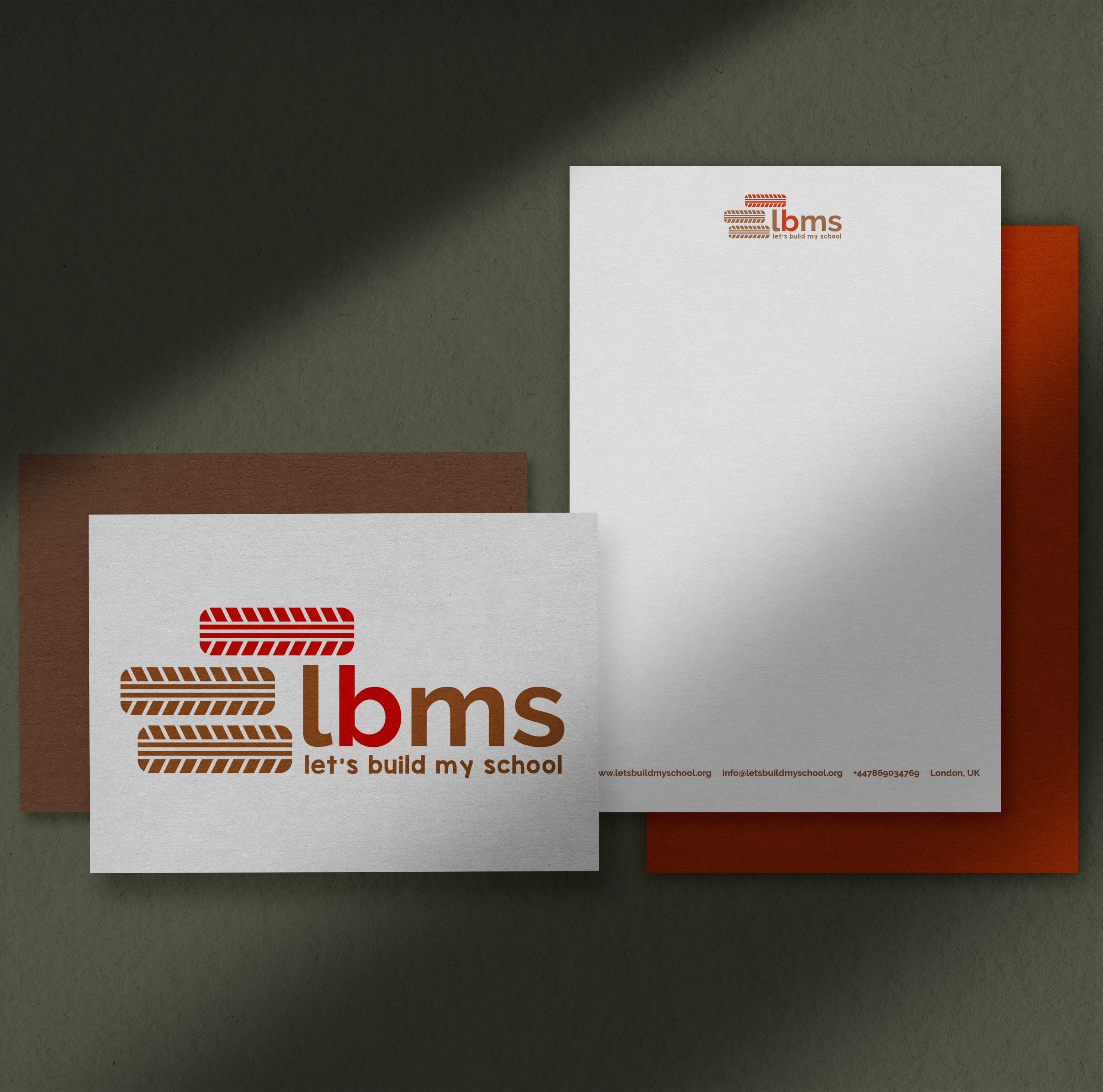
The tire symbol, a key construction material, became the primary motif in the logo. We then broke it down into alternate logos to broaden the brand language and accommodate various use cases.
![]()
SECONDARY LOGOS
![]()
![]()
![]()
The tire symbol, a key construction material, became the primary motif in the logo. We then broke it down into alternate logos to broaden the brand language and accommodate various use cases.

SECONDARY LOGOS

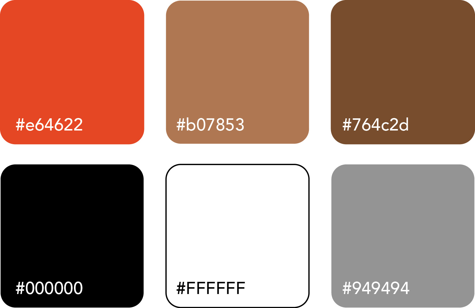
PALETTE
![]()
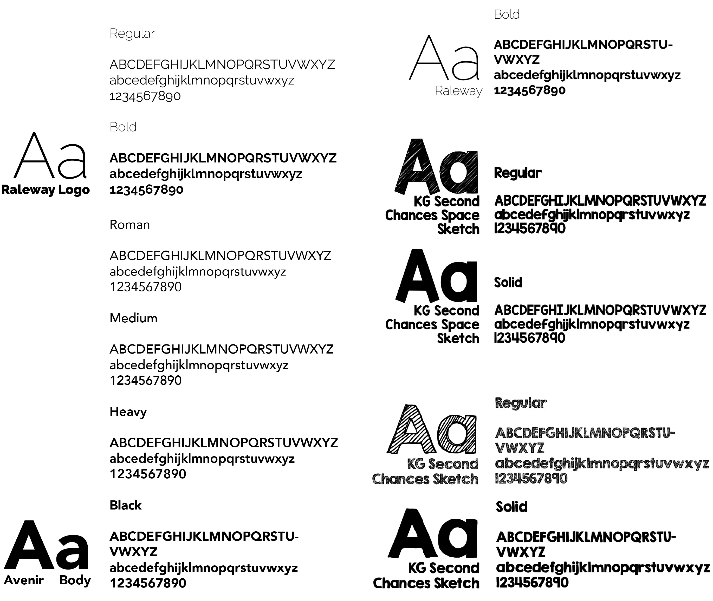
TYPOGRAPHY
![]()
IMAGERY
![]()

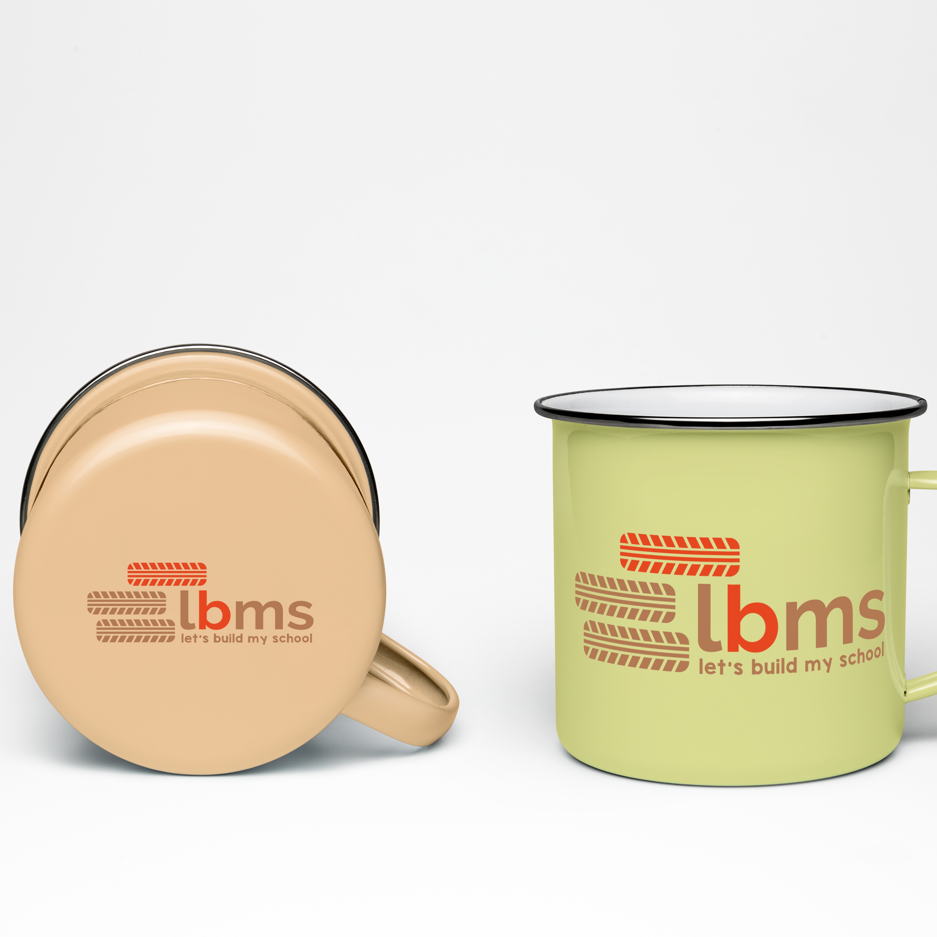
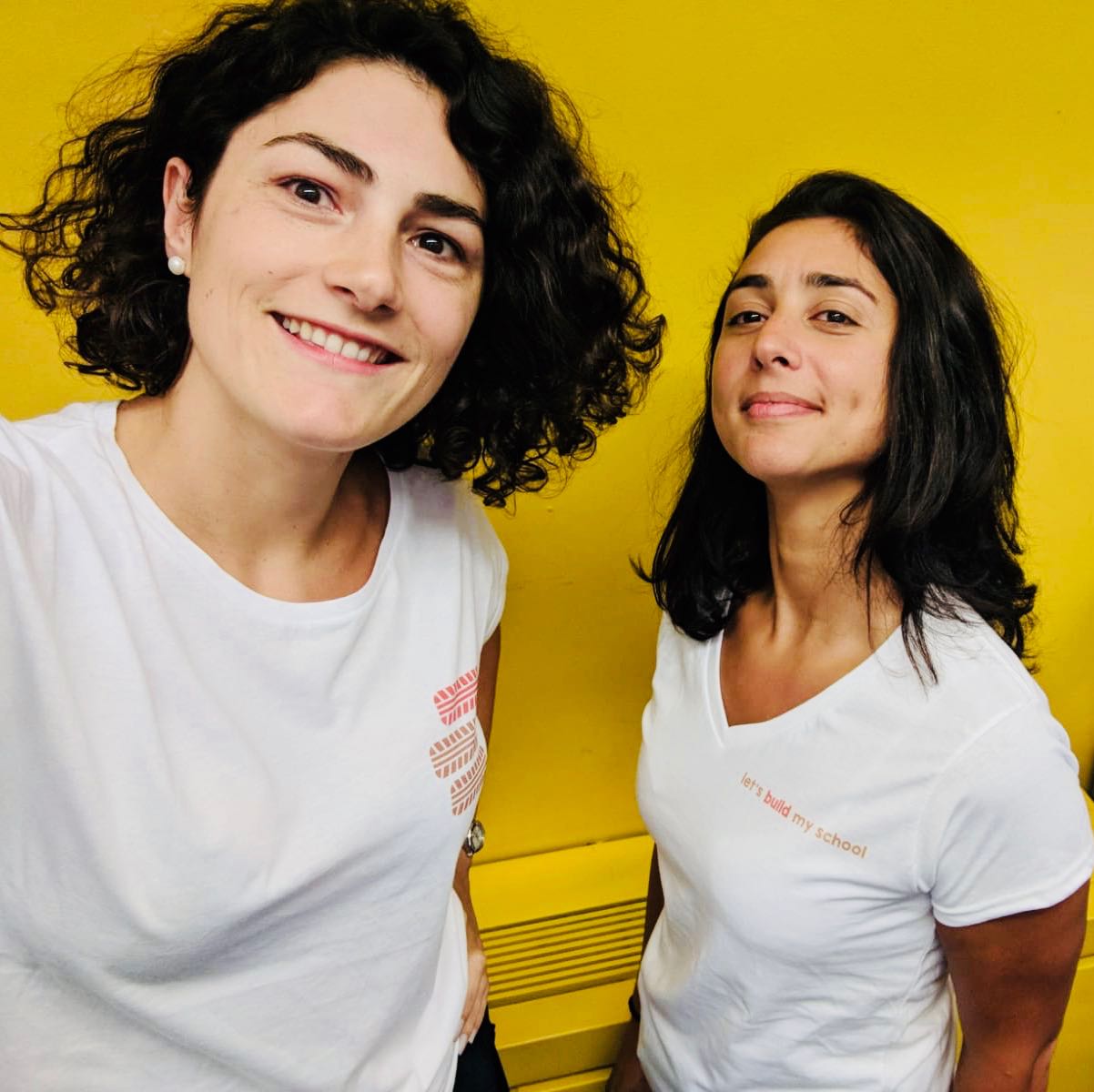
Merchandise Design


Reflections
THERE IS ALWAYS A BEGINNING
This marks my initial venture into solo freelance projects in website design and, simultaneously, my first live website delivery. Swiftly acquiring client and project management skills became imperative for project delivery and completion.
EMPHASIZING ACCESSIBILITY
Following the launch, I received feedback on accessibility, prompting me to prioritize accessible web design in my future projects.